It's pretty clear that within a football setting, clubs are largely using the same data. Most clubs will be using Wyscout/Instat...others may have access to StatsBomb and Metrica.
None the less, data quality discussion aside, Wyscout is used predominantly to quickly gain an overview of players (both from a video and data perspective). This dovetails with people up-skilling through the lockdown, taking various courses and becoming increasingly proficient in languages such as R and Python. This is a big asset within football!
Those that have read previously know that I am self teaching R and sharing any learnings that may be of interest around football analytics to others. By no means am I an authority on this, I've just found something that works, that might help others...I'm always happy to be corrected!
Anyway, the aim is to:
- Download Wyscout data
- Import into R
- Clean the headers
- Re-format the data from "wide" to "long" format
- Some example plots
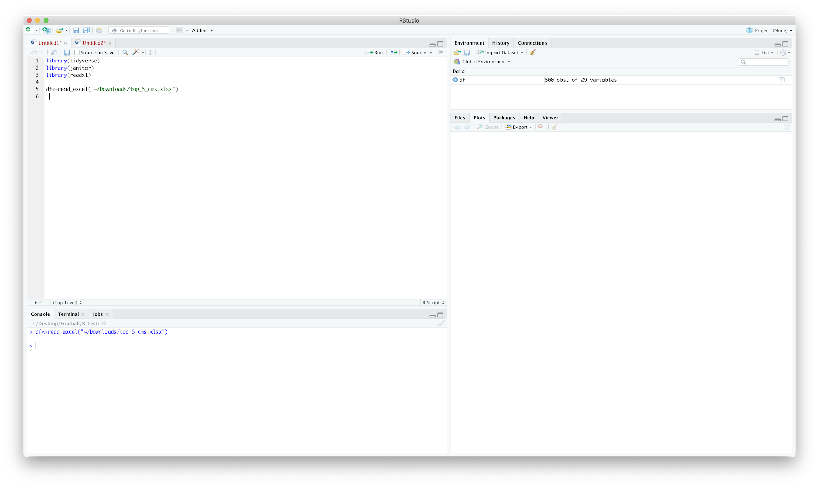
Before Wyscout changed their subscription options I signed up so can grab Wyscout data using the advanced search filter. I have just downloaded all players that play midfield in the top 5European leagues. Wyscout has a download limit so I've just downloaded the first 500 of the 532 players with a range of selected metrics.
The packages required for the following tutorial (type-thing!):
- Tidyverse
- Janitor
- Readxl
I have named my file 'top_5_cms'. Once loaded in we can see the dataframe ("df") has 500 rows (players) and 29 columns (metrics).
Through time I've realised that inspecting the data and 'cleaning' it is probably more time consuming than the plotting! So...checking it out...
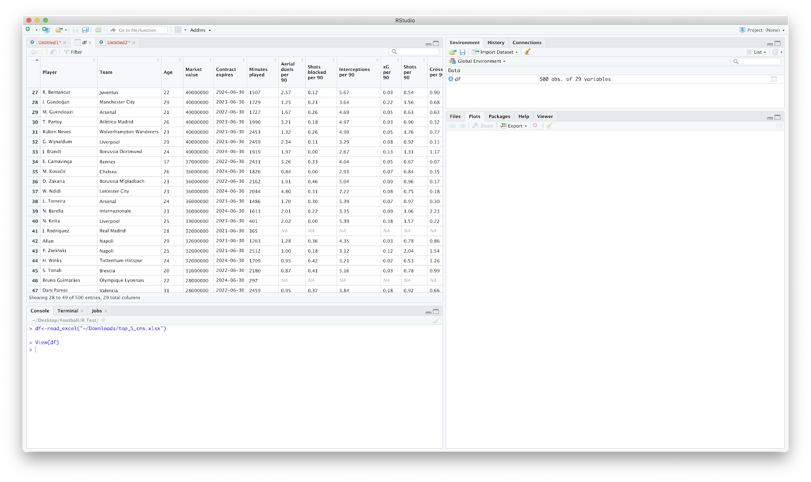
The primary issues that stand out are the column names and the "NA" spaces within the table.
Dplyr classifies 'tidy' data as:
"Each variable is saved in its own column. Each observation is saved in its own row"
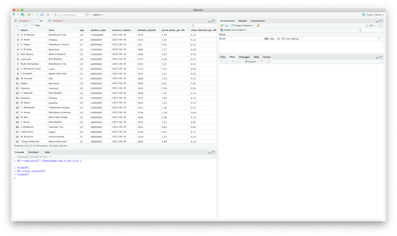
To first address the column names. The column names need to be joined between each word as spaces make it increasingly tough to reference. The janitor package handles the package nicely.
Using:
df<-clean_names(df)
Our data is now all lower case with "_" where we once had spaces:
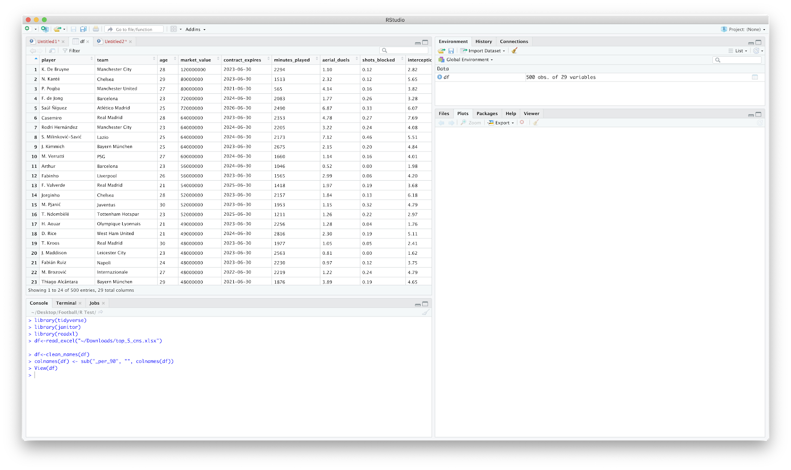
The next clean up I normally implement is around "_per_90" after each metric. The is more personal preference but probably handy to learn anyway.
colnames(df) <- sub("_per_90", "", colnames(df))
The above essentially looks at the "df", and substitutes "_per_90" with nothing (""). Checking the data frame again and things are cleaned up:
From here, we could plot a scatter pretty quickly:
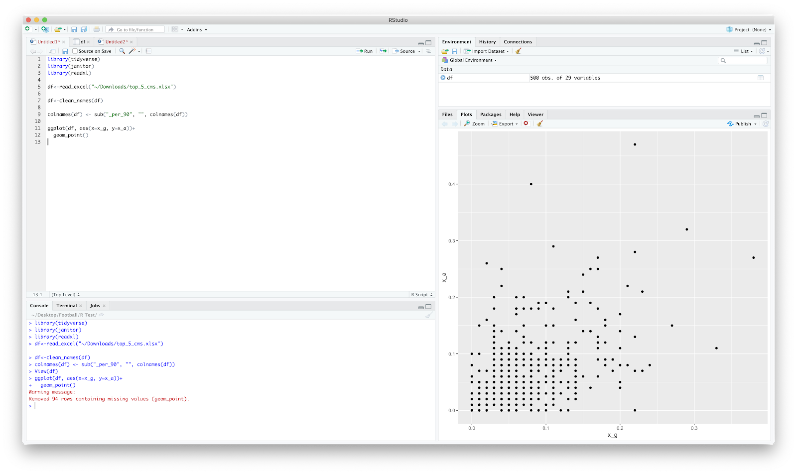
The 94 rows removed are those players with "NA" in the "x_g" and "x_a" columns.
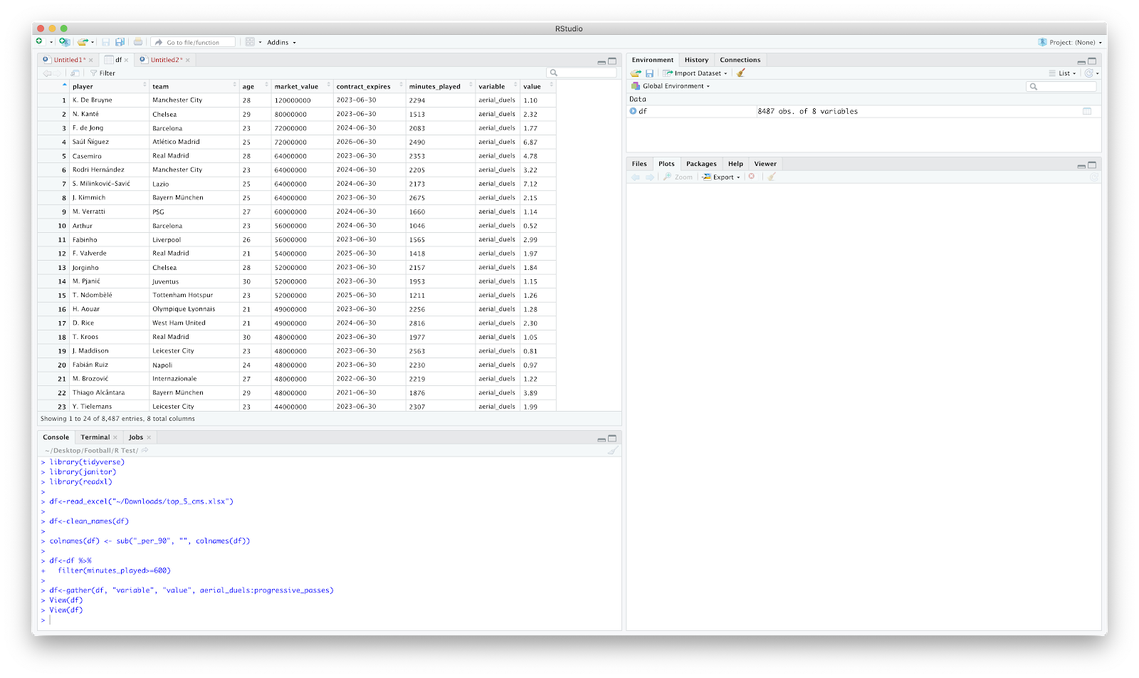
To solve this is simply use dplyr to filter by minutes_played. I've set an arbitrary cut off of 600minutes:
df<-df %>%
filter(minutes_played>=600)
The above reads as "filter df by minutes played equal or greater than 600".
This is all good for creating some scatters but you might want to get a little more creative. After much frustration I realised that for a majority of plotting the data needs to be 'long' rather than 'wide'.
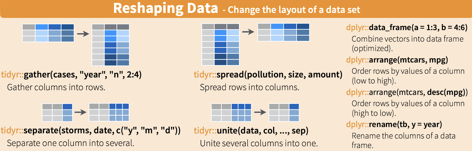
From the dplyr cheat sheet we can use the gather function within tidyr (part of the tidverse package) to gather the column into rows.
Using the below we can transform the data:
df<-gather(df, "variable", "value", aerial_duels:progressive_passes)
This should gather the 'df', create a 'variable' and 'value' column, but only reorders the columns from and including 'aerial_duels' to 'progressive_passes'. Inspecting the data we now have 8 columns and 8487 rows. The data now looks like the following:
I have attempted this in excel loooong ago and it was a nightmare. This is pretty straight forward! We can start to do something useful with this! Ridgeplots, jitters, bar charts.
A (very basic!) example using bar plots:
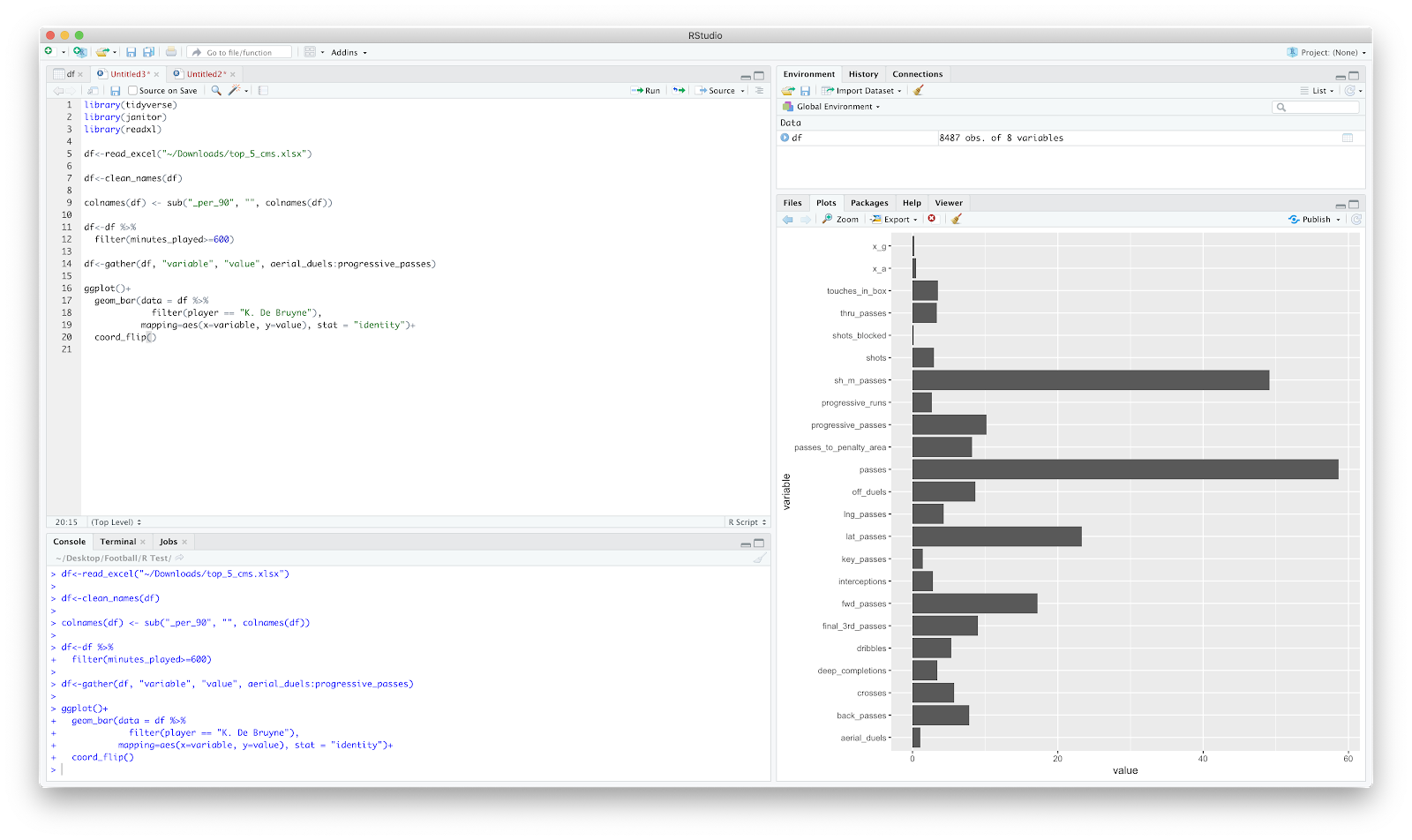
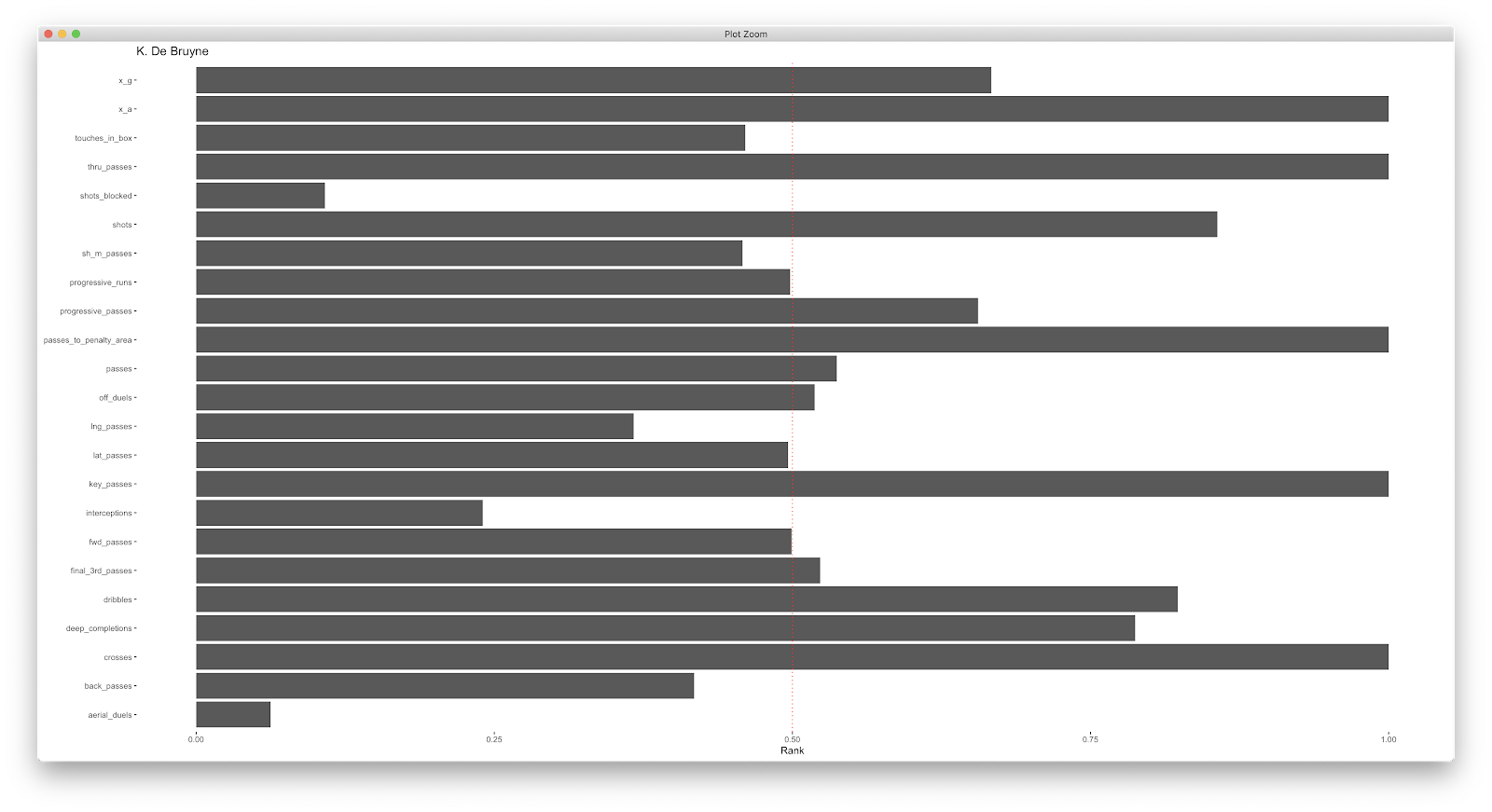
Above is a bar plot for all 'variables' for De Bruyne. The obvious issue here is the scaling of the axis...I normally opt to normalise the data. There are few ways you can apply this, but once you have you can go to town! A few (once again, very basic, examples!):
Using geom_bar:
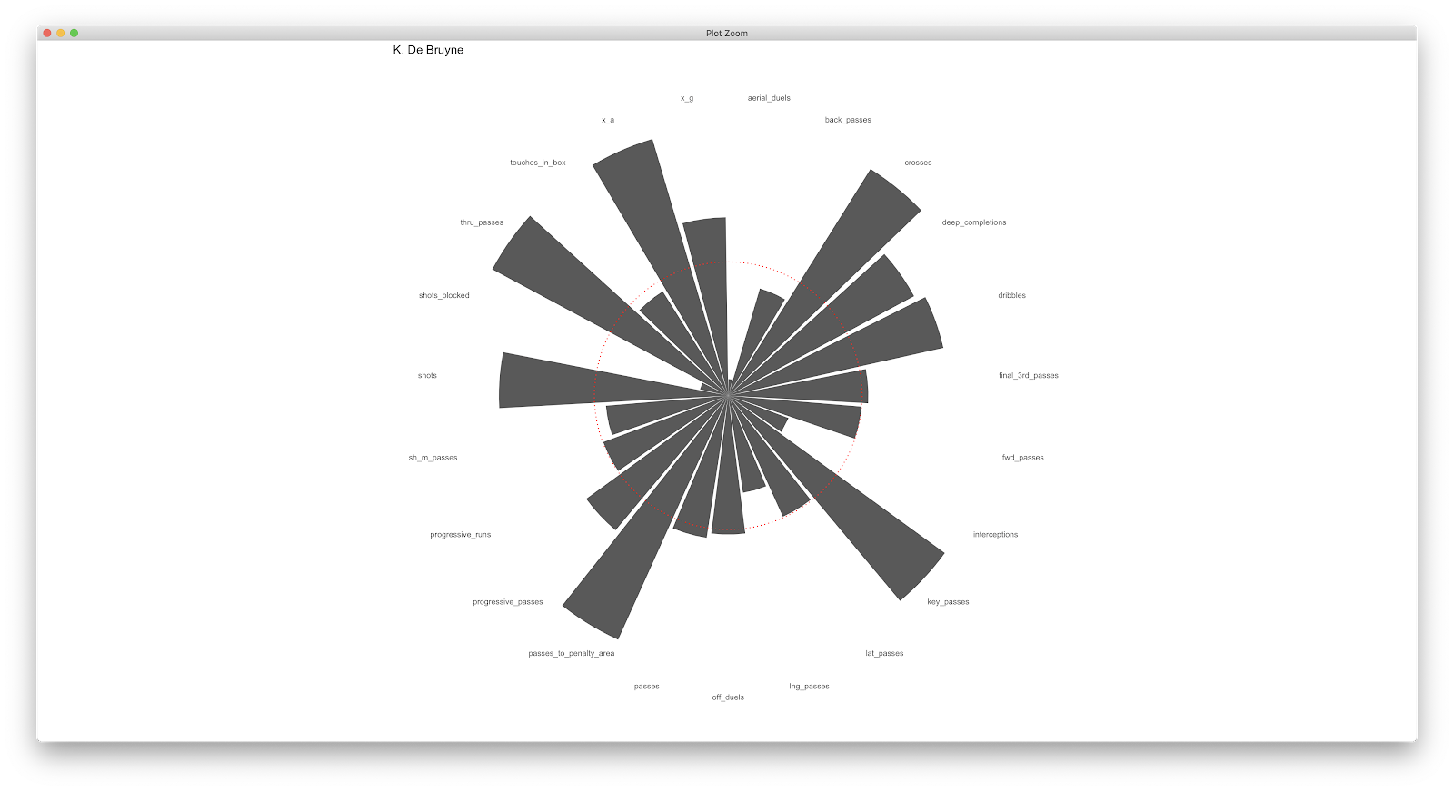
Adding geom_polar to geom_bar:
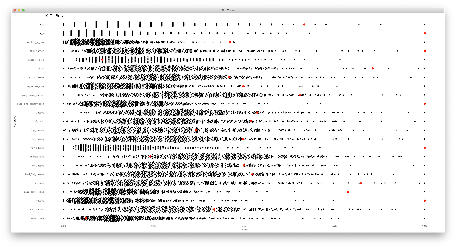
Using the ggbeeswarm package:
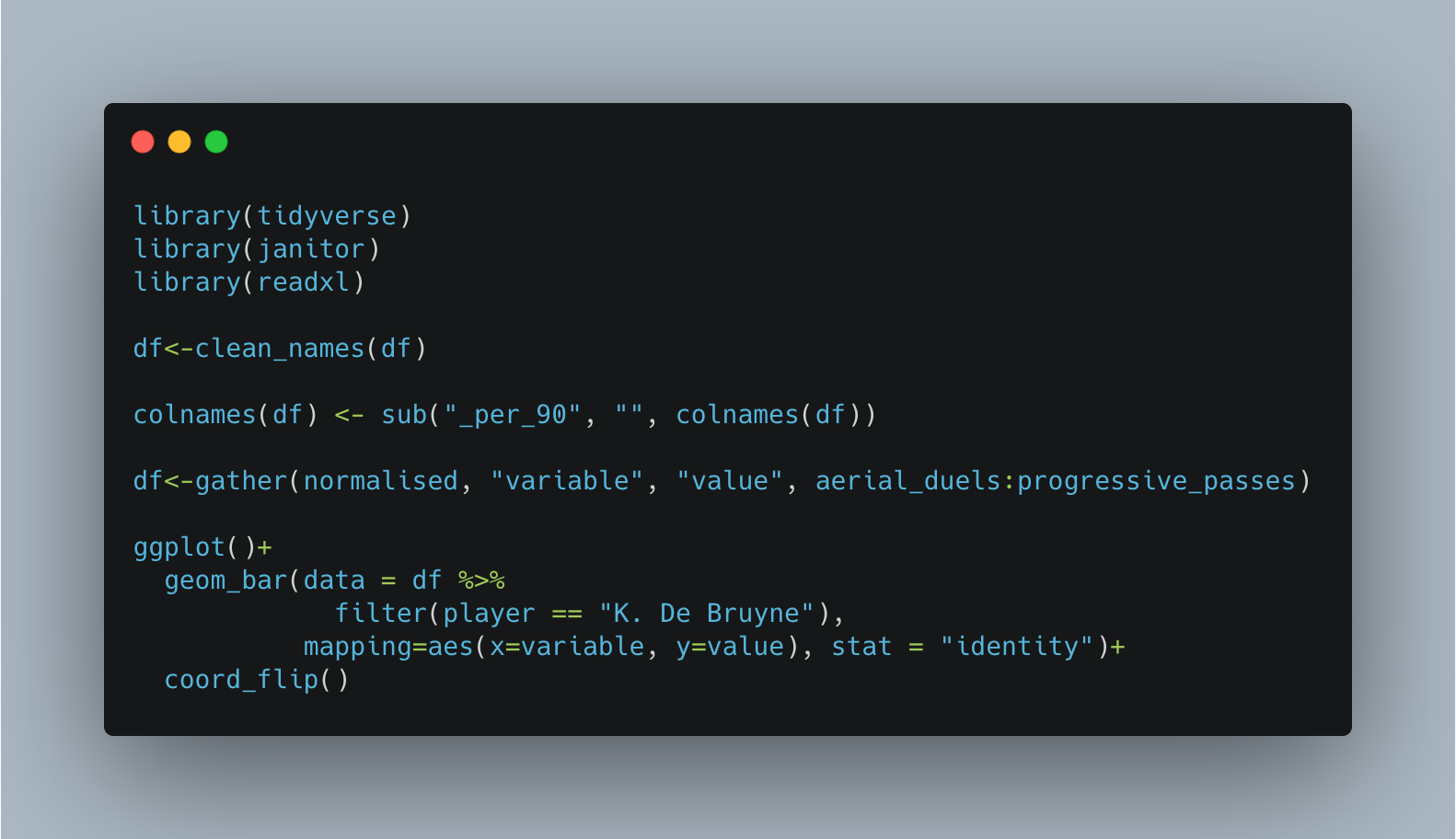
The above are plot basic and unimaginative but provide a quick overview of quickly handing some Wyscout data. The code for the cleaning and first bar plot is below:
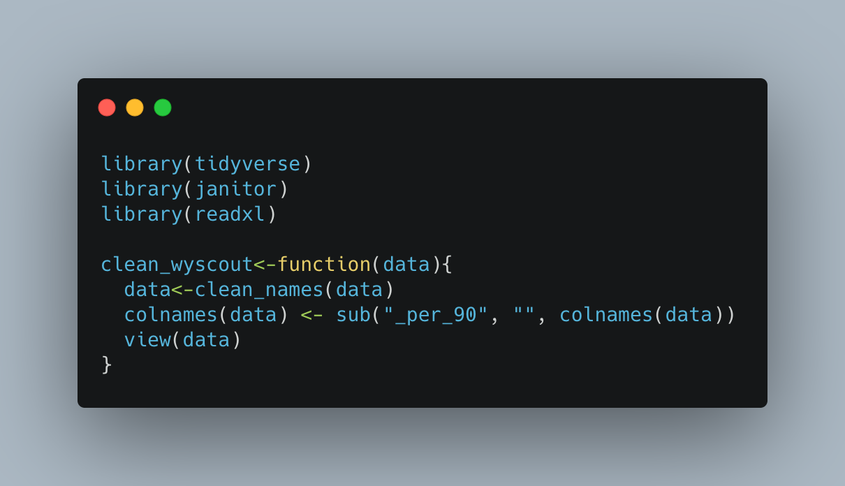
To speed up the above, you can create a straight forward function that will run the above cleaning steps with any data you import. I have loaded the same packages, and loaded the same data, but have this time named the data frame 'top_5'...this is the cleaning function:
clean_wyscout<-function(data){
data<-clean_names(data)
colnames(data) <- sub("_per_90", "", colnames(data))
view(data)
}
Simply, we can call the 'clean_wyscout' function, specify the data as 'top_5' and all the cleaning will be complete!
clean_wyscout(data = top_5)
A similar process can be used for creating visualisations adjusting the players etc!
This is a very quick and basic dive into handling Wyscout data. Its by no means definitive but has certainly helped me! Hopefully it's of help to others also. Let me know if you give it a go....feedback leads to these pieces being created!
None the less, data quality discussion aside, Wyscout is used predominantly to quickly gain an overview of players (both from a video and data perspective). This dovetails with people up-skilling through the lockdown, taking various courses and becoming increasingly proficient in languages such as R and Python. This is a big asset within football!
Those that have read previously know that I am self teaching R and sharing any learnings that may be of interest around football analytics to others. By no means am I an authority on this, I've just found something that works, that might help others...I'm always happy to be corrected!
Anyway, the aim is to:
- Download Wyscout data
- Import into R
- Clean the headers
- Re-format the data from "wide" to "long" format
- Some example plots
Before Wyscout changed their subscription options I signed up so can grab Wyscout data using the advanced search filter. I have just downloaded all players that play midfield in the top 5European leagues. Wyscout has a download limit so I've just downloaded the first 500 of the 532 players with a range of selected metrics.
The packages required for the following tutorial (type-thing!):
- Tidyverse
- Janitor
- Readxl
I have named my file 'top_5_cms'. Once loaded in we can see the dataframe ("df") has 500 rows (players) and 29 columns (metrics).
Through time I've realised that inspecting the data and 'cleaning' it is probably more time consuming than the plotting! So...checking it out...
The primary issues that stand out are the column names and the "NA" spaces within the table.
Dplyr classifies 'tidy' data as:
"Each variable is saved in its own column. Each observation is saved in its own row"
To first address the column names. The column names need to be joined between each word as spaces make it increasingly tough to reference. The janitor package handles the package nicely.
Using:
df<-clean_names(df)
Our data is now all lower case with "_" where we once had spaces:
The next clean up I normally implement is around "_per_90" after each metric. The is more personal preference but probably handy to learn anyway.
colnames(df) <- sub("_per_90", "", colnames(df))
The above essentially looks at the "df", and substitutes "_per_90" with nothing (""). Checking the data frame again and things are cleaned up:
From here, we could plot a scatter pretty quickly:
The 94 rows removed are those players with "NA" in the "x_g" and "x_a" columns.
To solve this is simply use dplyr to filter by minutes_played. I've set an arbitrary cut off of 600minutes:
df<-df %>%
filter(minutes_played>=600)
The above reads as "filter df by minutes played equal or greater than 600".
This is all good for creating some scatters but you might want to get a little more creative. After much frustration I realised that for a majority of plotting the data needs to be 'long' rather than 'wide'.
From the dplyr cheat sheet we can use the gather function within tidyr (part of the tidverse package) to gather the column into rows.
Using the below we can transform the data:
df<-gather(df, "variable", "value", aerial_duels:progressive_passes)
This should gather the 'df', create a 'variable' and 'value' column, but only reorders the columns from and including 'aerial_duels' to 'progressive_passes'. Inspecting the data we now have 8 columns and 8487 rows. The data now looks like the following:
I have attempted this in excel loooong ago and it was a nightmare. This is pretty straight forward! We can start to do something useful with this! Ridgeplots, jitters, bar charts.
A (very basic!) example using bar plots:
Above is a bar plot for all 'variables' for De Bruyne. The obvious issue here is the scaling of the axis...I normally opt to normalise the data. There are few ways you can apply this, but once you have you can go to town! A few (once again, very basic, examples!):
Using geom_bar:
Adding geom_polar to geom_bar:
Using the ggbeeswarm package:
The above are plot basic and unimaginative but provide a quick overview of quickly handing some Wyscout data. The code for the cleaning and first bar plot is below:
To speed up the above, you can create a straight forward function that will run the above cleaning steps with any data you import. I have loaded the same packages, and loaded the same data, but have this time named the data frame 'top_5'...this is the cleaning function:
clean_wyscout<-function(data){
data<-clean_names(data)
colnames(data) <- sub("_per_90", "", colnames(data))
view(data)
}
Simply, we can call the 'clean_wyscout' function, specify the data as 'top_5' and all the cleaning will be complete!
clean_wyscout(data = top_5)
A similar process can be used for creating visualisations adjusting the players etc!
This is a very quick and basic dive into handling Wyscout data. Its by no means definitive but has certainly helped me! Hopefully it's of help to others also. Let me know if you give it a go....feedback leads to these pieces being created!
Good stuff mate
ReplyDeleteThanks for posting this blog. I am very impressed with your blog and it is very useful for me and others.
ReplyDeleteเว็บบอล
Nursing jobs in New Zealand offer a diverse and rewarding career path, attracting professionals from around the globe. With a strong demand for qualified nurses, opportunities abound in public hospitals, private clinics, and community health settings. Newly registered nurses can expect competitive salaries, typically ranging from NZD $60,000 to $75,000 annually, with potential increases for those in specialized areas or leadership roles. The New Zealand healthcare system emphasizes a holistic approach to patient care, fostering a supportive and collaborative work environment. Additionally, nurses can benefit from a great work-life balance, as many positions offer flexible schedules. The country’s stunning natural landscapes and diverse culture further enhance the appeal of nursing in New Zealand. Furthermore, international nurses may find pathways for residency which can lead to long-term opportunities and lifestyle benefits. Overall, New Zealand presents an attractive destination for nursing professionals seeking both career advancement and a fulfilling life experience.
ReplyDeletehttps://www.dynamichealthstaff.com/new-zealand-nursing-jobs