Following my first tutorial loading R and importing StatsBomb data to plot passes in a specific FAWSL match I've had loads of good feedback!
(Tutorial One)
There seems to be a general appetite for a second part how the plots can be progressed and further information added - so lets give it a go!
As always, I will caveat that I'm no expert in R and have been self teaching since Christmas 2019 - as such I'm presenting something that works for me but may not be the *entirely* correct way of doing things!
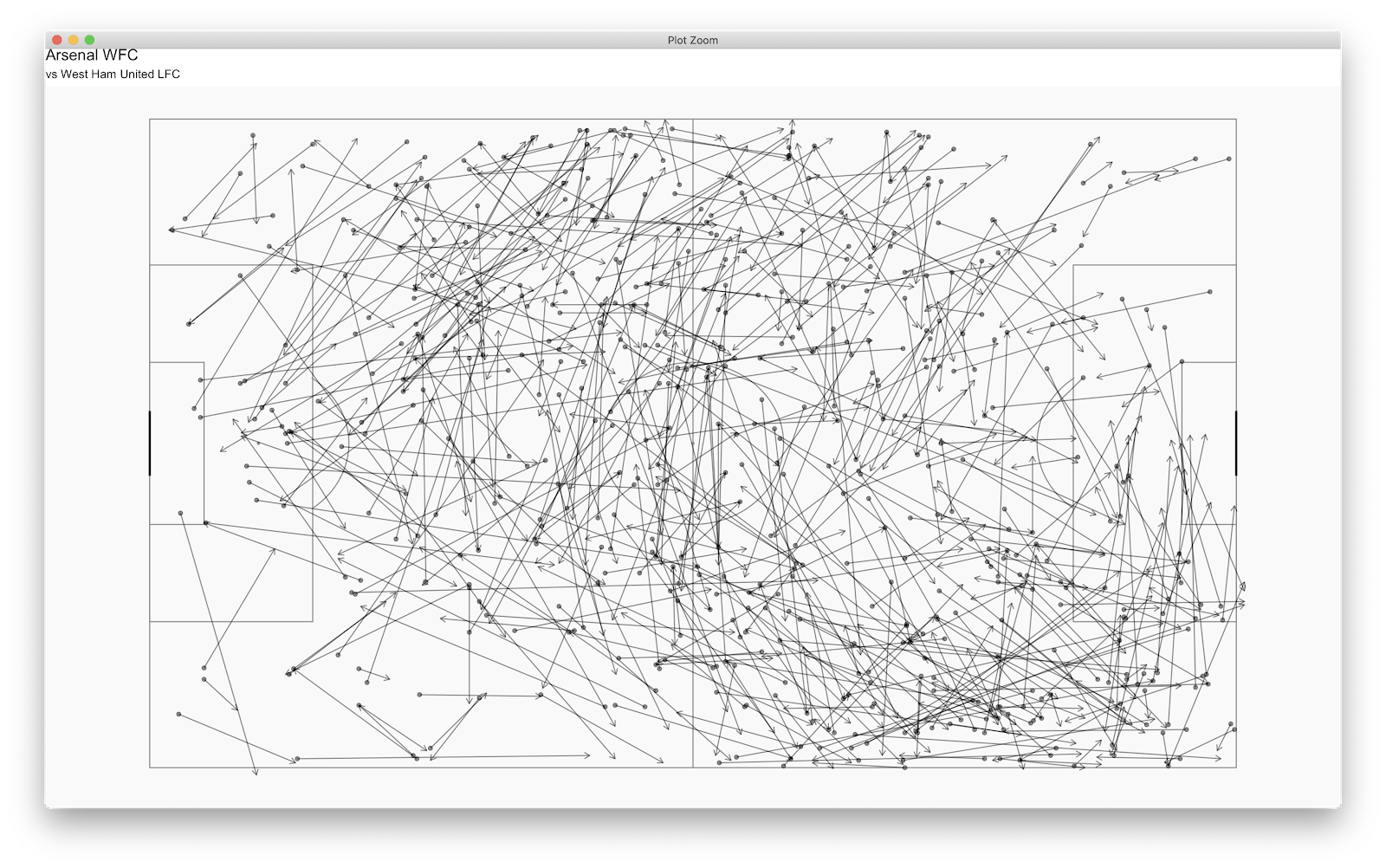
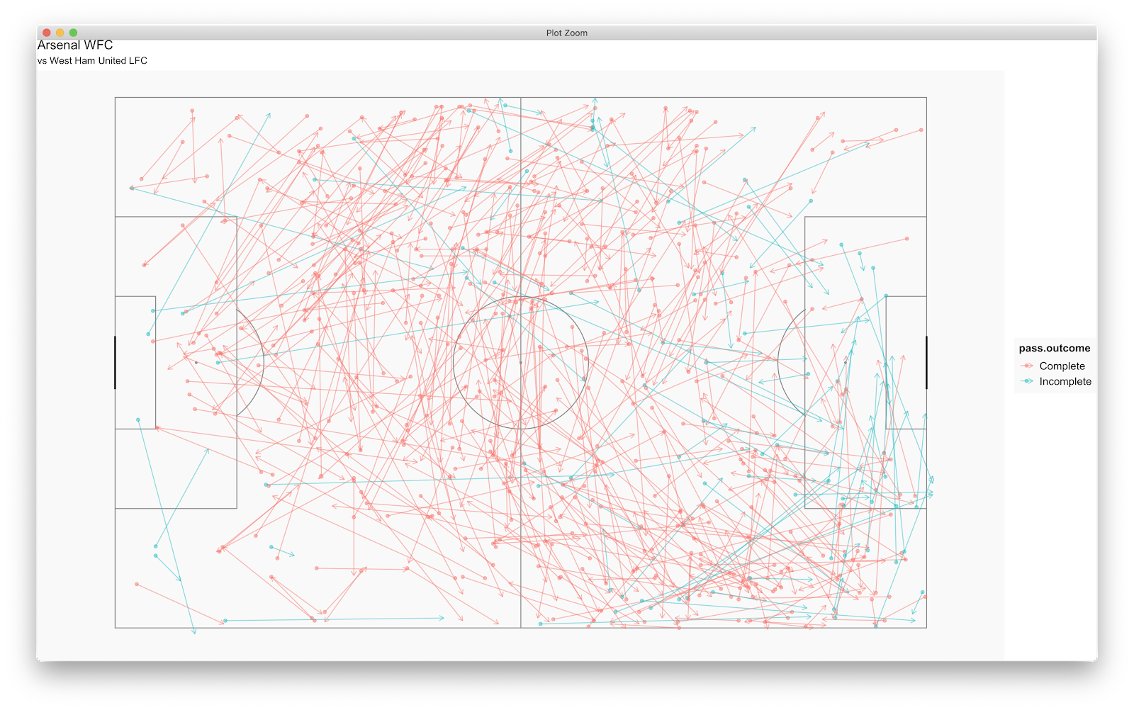
Anyway, below was the final pass plot we ended up with after the first tutorial. Great that we've plotted the passes, but what can we learn from it? What could a practical application be if we wanted coaches/scouts to take away insight?
Looking at below, for me, the plot infers a high density of passes on the right wing in the final third with regular crosses (in this specific match!) along side regular passing actions in the Left Centre Back location. This is from a quick glimpse but the information is limited.
There are many directions you could build on the above - I'm just going to type as things enter my head!
First thing - the success of the above passes would probably be handy. Building on the previous code, we can add a line or two to return this.
Firstly, we will edit our d1 component. Previously the code was:
d1<-StatsBombData%>%
filter(match_id == 2275096, type.name == "Pass" team.name == "Arsenal WFC")
This filtered all the Arsenal WFC passes from the Arsenal WFC vs West Ham United LFC match.
Our new d1 code will be:
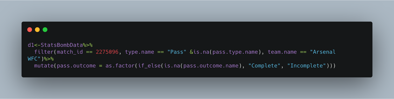
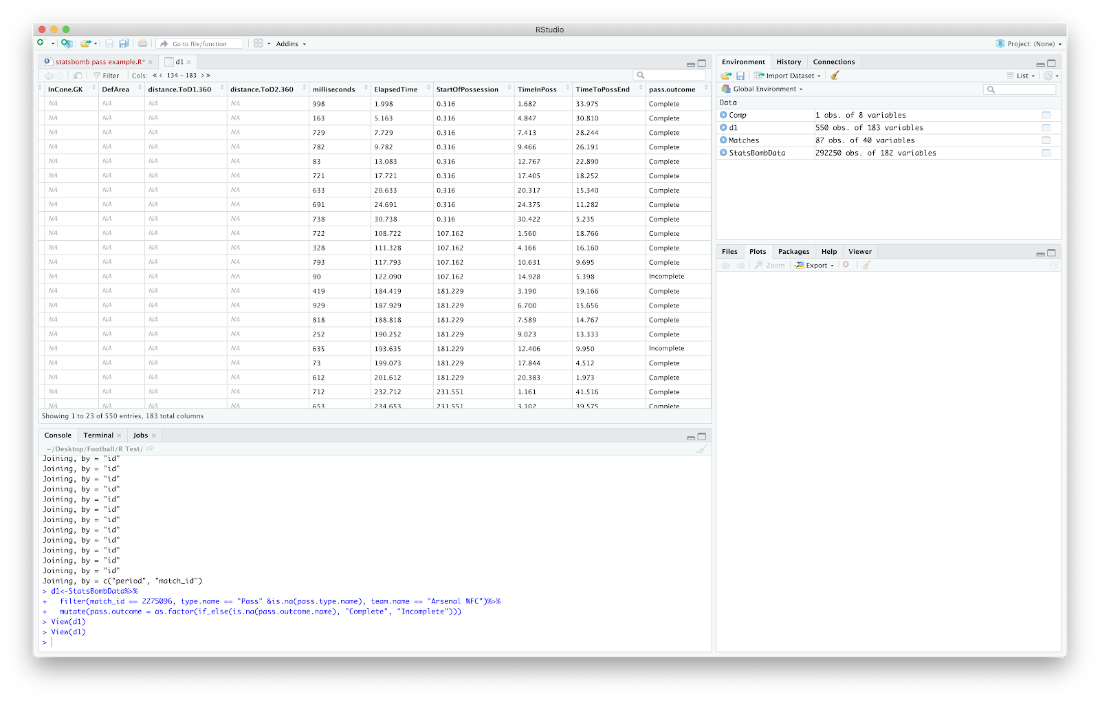
This once more takes the Arsenal WFC passes vs West Ham United LFC and creates a new column (mutate(pass.outcome)) of complete and incomplete passes. You can check this by clicking d1 and scrolling the data frame to the final column:
We now have a column of incomplete and complete passes. Now to plot!
To add the pass outcome to the plot simply add:
colour = pass.outcome
To both the geom_point and geom_segment aesthetic. The plot code should hopefully now look:
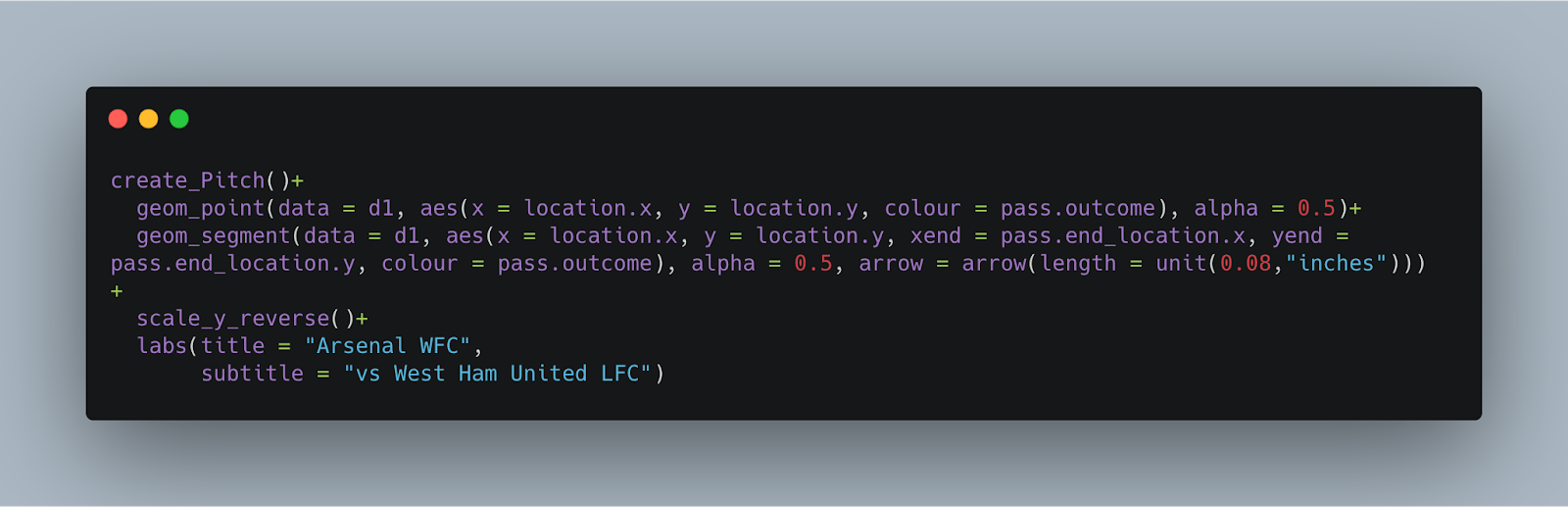
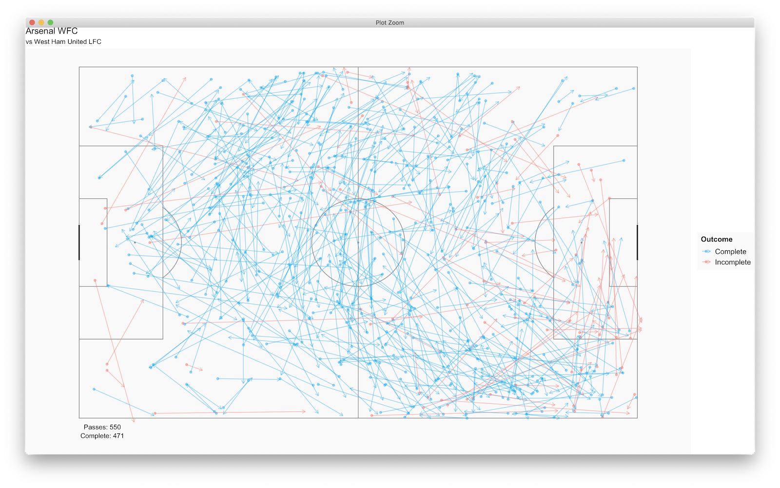
With the plot looking like:
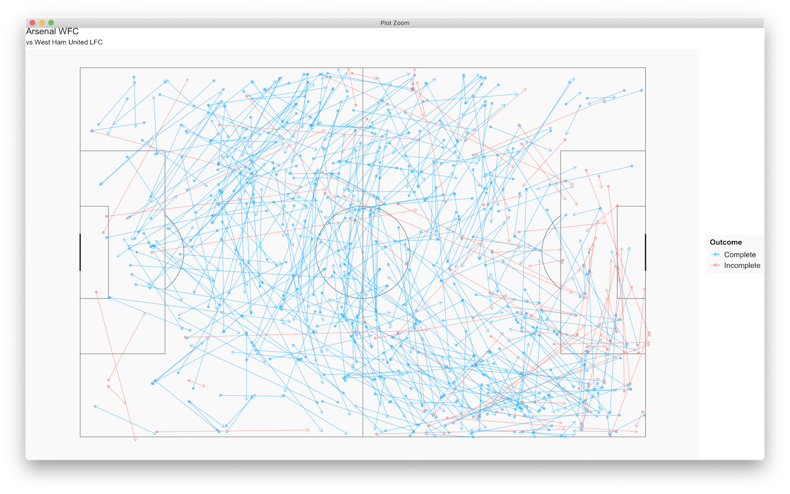
Yay. Successful/unsuccessful passes plotted. The R default here is to plot red as complete and blue as incomplete. For me, that is counter intuitive so gave it a quick google and found the scale_colour_manual function (https://ggplot2.tidyverse.org/reference/scale_manual.html). The first example is all we need here so:
scale_colour_manual(values = c("#00b0f6", "#f8766d"), name = "Outcome")
I used https://www.color-hex.com/ to generate the hex codes but we *hopefully* now have red for failed passes and blue for successful. This is added to the plot code, hit run anddddddd.......
You can have a play with colours - this, for me, makes sense when taking a quick look.
As we now have the success of passes, we can look to those previously highlighted areas. All those crosses we highlighted at the start from the right side in the final third now look to be limited in success - however we would expect West Ham LFC to defend this area pretty rigorously...therefore, are these failed passes due to the quality of the pass or the quality of defending? Probably an area to consult video.
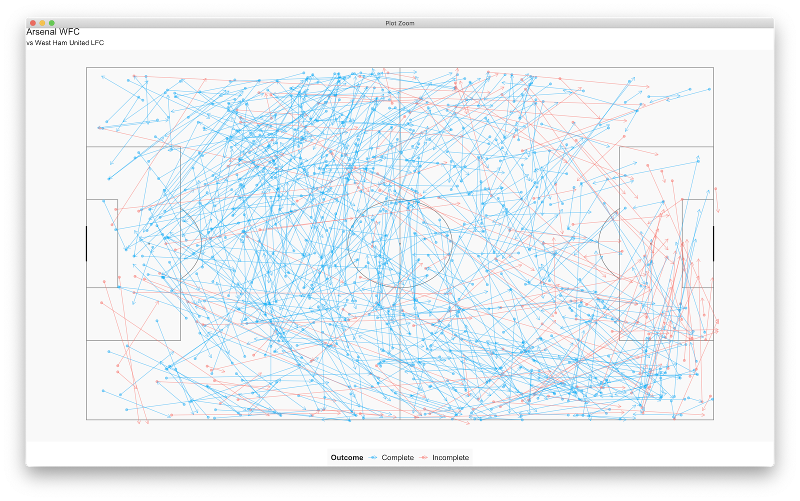
The default legend position is on the right, however you can use theme() to move it. For example:
theme(legend.position = "bottom")
Should result in:
Lovely stuff. What next? We can see Arsenal made plenty of passes so would probably add some good information if we could establish how many passes were made along with how many were successful. I will do this in dplyr which is already in the tidyverse package which can be used for data manipulation. I'm not great with dplyr but should know enough to get by!
Our aim....to find the individual number of successful and unsuccessful passes before finding the total number of passes - then add to the pass map!
The code to find successful and unsuccessful passes:
passes<-d1%>%
filter(type.name == "Pass")%>%
group_by(pass.outcome)%>%
tally()
We create a new function (passes) before taking our d1 data frame that has our Arsenal vs West Ham match in. We next filter passses (filter(type.name == "Pass")%>%) before grouping by the new column we created earlier (group_by(pass.outcome)%>%). Finally, we want a tally of successful and unsuccessful passes so use the tally() function. Checking the 'passes' function you should now have:
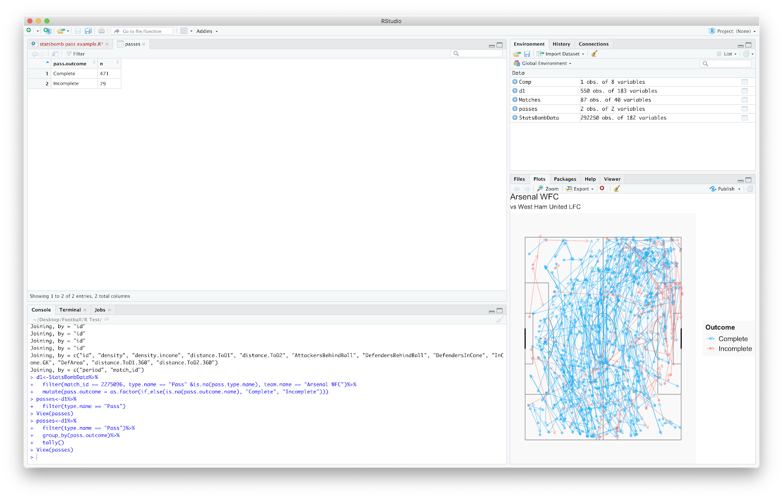
Bang! 471 successful passes with 79 incomplete. We need to sum() the two:
passes_1<-sum(passes$n)
The above creates 'passes_1' as a new function, we then sum() the 'passes' data frame with $n specifying the n column.
We should now have 'passes_1' totalling 550 specified under 'values'.
Finally, we will specify only complete passes by using:
passes_2<-passes%>%
distinct(passes$n[1])
This returns the number in the first row [1] in the 'n' column.
Using this information we will add to the pass plot using geom_text.
Plot the number of passes:
geom_text(aes(x = 5, y=-2, label = paste0("Passes: ", passes_1)))
The above plots the total passes that we tallied in 'passes_1' on to the x/y axis. Secondly, to plot the completed passes:
geom_text(aes(x = 5, y=-4,label = paste0("Complete: ",passes_2)))
We should now have:
I will probably now leave it there for adding tallies, however it would probably be a good exercise to express the pass completion as a percentage then add to the plot!
Finally, to glean further information from the pass plot I would use the StatsBomb pressure events. This can be added as a filter once more to the d1 function:
d1<-StatsBombData%>%
filter(match_id == 2275096, type.name == "Pass" &is.na(pass.type.name), team.name == "Arsenal WFC")%>%
filter(under_pressure == "TRUE")%>%
mutate(pass.outcome = as.factor(if_else(is.na(pass.outcome.name), "Complete", "Incomplete")))
Running this plus the other functions will update the pass plot - 168 passes under pressure with 143 completed:
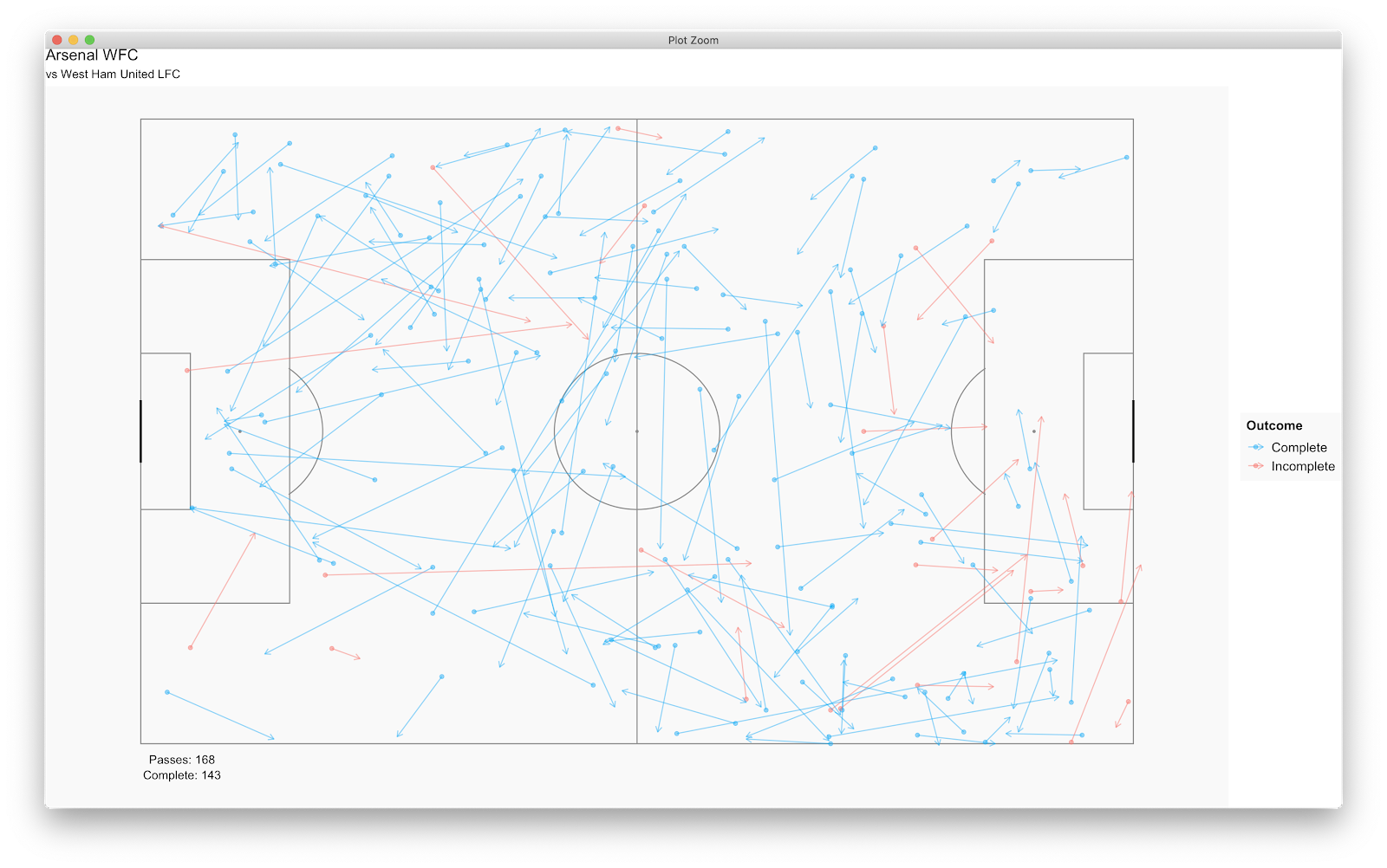
This is where we can establish some decent insight:
- How many forward passes were completed when pressured? Many look to have been played laterally or backwards.
- When Arsenal were in their own defensive third - when (rarely) pressured they appeared to go long
- West Ham appeared to mainly press the Arsenal left back and Arsenal right wing
- you would expect more pressure events on the edge of the West Ham box - combined with the Arsenal failed passes it appears West Ham deployed a low block in their own box whilst trying to execute a higher press
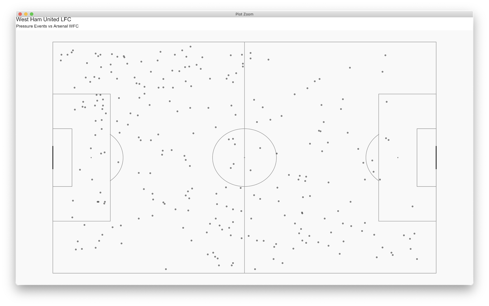
These are just a few quick notes on the above but this adds far more value than the plot in tutorial one. If you wanted to double check you could plot solely the West Ham pressure events:
I have a million other things in my head but probably best to leave it there!
As always, feedback is welcome - I'm happy to hear anything good or bad! If you need anything give me a shout...am happy to help where I can.
Let me know if this works well!
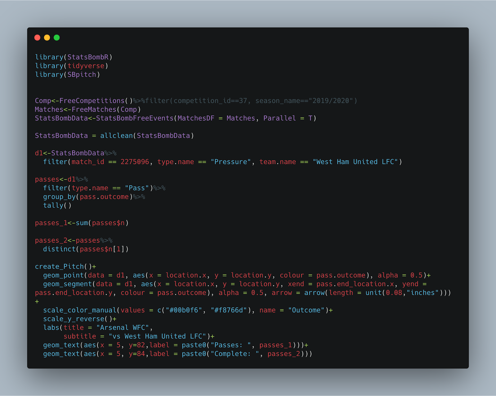
Final Code:
(Tutorial One)
There seems to be a general appetite for a second part how the plots can be progressed and further information added - so lets give it a go!
As always, I will caveat that I'm no expert in R and have been self teaching since Christmas 2019 - as such I'm presenting something that works for me but may not be the *entirely* correct way of doing things!
Anyway, below was the final pass plot we ended up with after the first tutorial. Great that we've plotted the passes, but what can we learn from it? What could a practical application be if we wanted coaches/scouts to take away insight?
Looking at below, for me, the plot infers a high density of passes on the right wing in the final third with regular crosses (in this specific match!) along side regular passing actions in the Left Centre Back location. This is from a quick glimpse but the information is limited.
There are many directions you could build on the above - I'm just going to type as things enter my head!
First thing - the success of the above passes would probably be handy. Building on the previous code, we can add a line or two to return this.
Firstly, we will edit our d1 component. Previously the code was:
d1<-StatsBombData%>%
filter(match_id == 2275096, type.name == "Pass" team.name == "Arsenal WFC")
This filtered all the Arsenal WFC passes from the Arsenal WFC vs West Ham United LFC match.
Our new d1 code will be:
This once more takes the Arsenal WFC passes vs West Ham United LFC and creates a new column (mutate(pass.outcome)) of complete and incomplete passes. You can check this by clicking d1 and scrolling the data frame to the final column:
We now have a column of incomplete and complete passes. Now to plot!
To add the pass outcome to the plot simply add:
colour = pass.outcome
To both the geom_point and geom_segment aesthetic. The plot code should hopefully now look:
With the plot looking like:
Yay. Successful/unsuccessful passes plotted. The R default here is to plot red as complete and blue as incomplete. For me, that is counter intuitive so gave it a quick google and found the scale_colour_manual function (https://ggplot2.tidyverse.org/reference/scale_manual.html). The first example is all we need here so:
scale_colour_manual(values = c("#00b0f6", "#f8766d"), name = "Outcome")
I used https://www.color-hex.com/ to generate the hex codes but we *hopefully* now have red for failed passes and blue for successful. This is added to the plot code, hit run anddddddd.......
You can have a play with colours - this, for me, makes sense when taking a quick look.
As we now have the success of passes, we can look to those previously highlighted areas. All those crosses we highlighted at the start from the right side in the final third now look to be limited in success - however we would expect West Ham LFC to defend this area pretty rigorously...therefore, are these failed passes due to the quality of the pass or the quality of defending? Probably an area to consult video.
The default legend position is on the right, however you can use theme() to move it. For example:
theme(legend.position = "bottom")
Should result in:
Lovely stuff. What next? We can see Arsenal made plenty of passes so would probably add some good information if we could establish how many passes were made along with how many were successful. I will do this in dplyr which is already in the tidyverse package which can be used for data manipulation. I'm not great with dplyr but should know enough to get by!
Our aim....to find the individual number of successful and unsuccessful passes before finding the total number of passes - then add to the pass map!
The code to find successful and unsuccessful passes:
passes<-d1%>%
filter(type.name == "Pass")%>%
group_by(pass.outcome)%>%
tally()
We create a new function (passes) before taking our d1 data frame that has our Arsenal vs West Ham match in. We next filter passses (filter(type.name == "Pass")%>%) before grouping by the new column we created earlier (group_by(pass.outcome)%>%). Finally, we want a tally of successful and unsuccessful passes so use the tally() function. Checking the 'passes' function you should now have:
Bang! 471 successful passes with 79 incomplete. We need to sum() the two:
passes_1<-sum(passes$n)
The above creates 'passes_1' as a new function, we then sum() the 'passes' data frame with $n specifying the n column.
We should now have 'passes_1' totalling 550 specified under 'values'.
Finally, we will specify only complete passes by using:
passes_2<-passes%>%
distinct(passes$n[1])
This returns the number in the first row [1] in the 'n' column.
Using this information we will add to the pass plot using geom_text.
Plot the number of passes:
geom_text(aes(x = 5, y=-2, label = paste0("Passes: ", passes_1)))
The above plots the total passes that we tallied in 'passes_1' on to the x/y axis. Secondly, to plot the completed passes:
geom_text(aes(x = 5, y=-4,label = paste0("Complete: ",passes_2)))
We should now have:
I will probably now leave it there for adding tallies, however it would probably be a good exercise to express the pass completion as a percentage then add to the plot!
Finally, to glean further information from the pass plot I would use the StatsBomb pressure events. This can be added as a filter once more to the d1 function:
d1<-StatsBombData%>%
filter(match_id == 2275096, type.name == "Pass" &is.na(pass.type.name), team.name == "Arsenal WFC")%>%
filter(under_pressure == "TRUE")%>%
mutate(pass.outcome = as.factor(if_else(is.na(pass.outcome.name), "Complete", "Incomplete")))
Running this plus the other functions will update the pass plot - 168 passes under pressure with 143 completed:
This is where we can establish some decent insight:
- How many forward passes were completed when pressured? Many look to have been played laterally or backwards.
- When Arsenal were in their own defensive third - when (rarely) pressured they appeared to go long
- West Ham appeared to mainly press the Arsenal left back and Arsenal right wing
- you would expect more pressure events on the edge of the West Ham box - combined with the Arsenal failed passes it appears West Ham deployed a low block in their own box whilst trying to execute a higher press
These are just a few quick notes on the above but this adds far more value than the plot in tutorial one. If you wanted to double check you could plot solely the West Ham pressure events:
I have a million other things in my head but probably best to leave it there!
As always, feedback is welcome - I'm happy to hear anything good or bad! If you need anything give me a shout...am happy to help where I can.
Let me know if this works well!
Final Code:
Comments
Post a Comment