I have more time on my hands so thought it would be good fun to show some steps from creating creating scatters to plotting event data to show those that show up favourably in initial searches.
The question that I posed myself was:
"How can we go beyond scatters to learn more about a players output?"
There has been an increase in scatter plots to show players that excel, however they don't tell the whole story.
As always, I'm still learning code myself so I'm sure there is code in here that will upset experienced coders! Sorry!
Anyway, a rough idea of how this will look -
- download data from fbref.com
- plot a scatter using the data
- filter the top 9 performers for one parameter
- plot the event data
- compare the player outputs
Lets goooooooooooo
Lets fire up:
library(StatsBombR)
library(tidyverse)
library(ggsoccer)
library(ggrepel)
We could create the P90 data for the WSL ourselves by using the StatsBomb data, however I'm being lazy by downloading from fbref.com. I'm looking at two simple metrics - shots P90 and shots assisted P90.
Once I've downloaded from fbref I remove the top row and save as .csv.
As the data we require sits in two different files, there is some preparation to do before plotting.
The below loads the key pass (df) and shot (df1) data and adds to a data frame.
From here, I selected the columns we require in both dataframes (df = Player, X90s, and KP) and df1 = Player, Sh.90. Finally, I combined the two data frames using left_join before filtering players that have only played >5 90s.
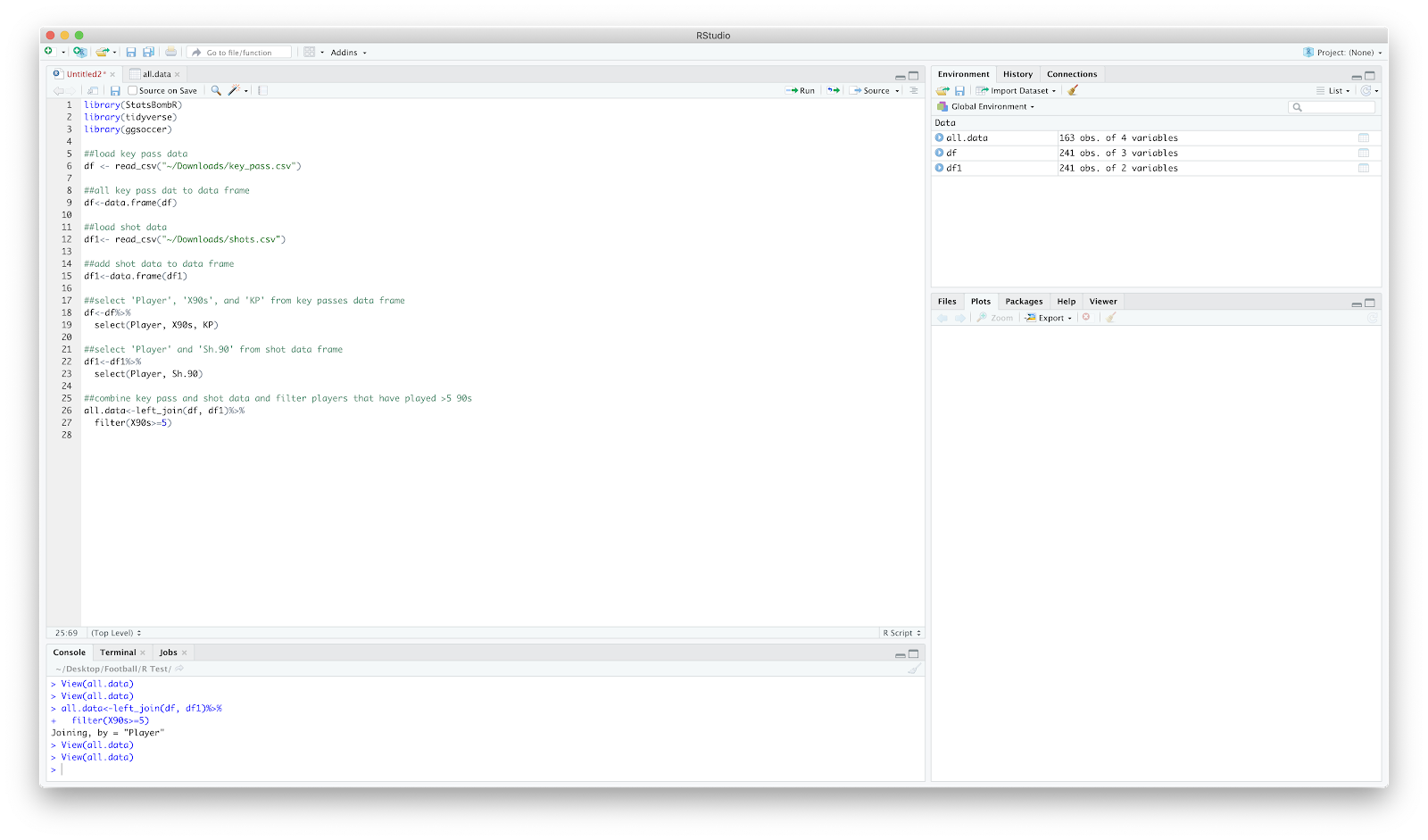
View(all.data) should return 4 columns of Player, KP, X90s and Sh.90
Now that we have the numbers we require in one place, we can move on to plotting. Personally, I like to throw a quick scatter together as it gives a quick overview - plus I tend to need something visual for it to sink in!
Anyway, ggplot to throw a scatter together. You can make it as fancy as you like, I just use geom_point and ggrepel.
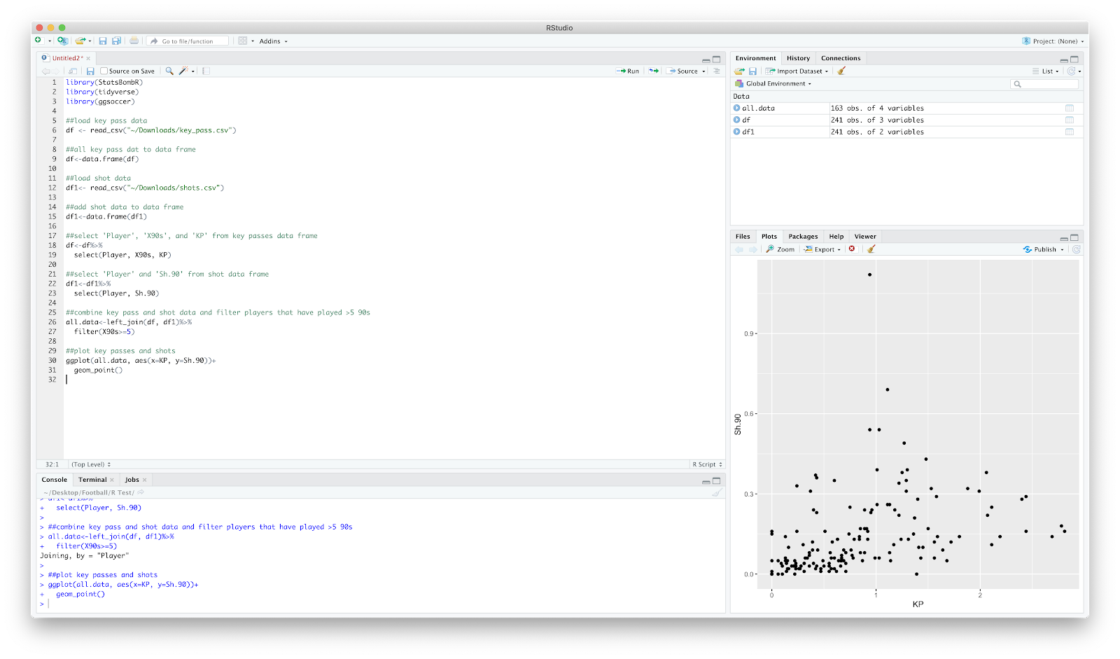
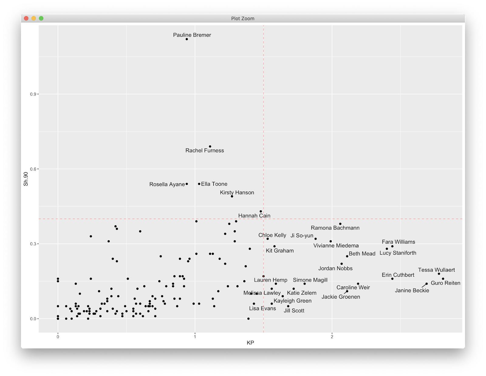
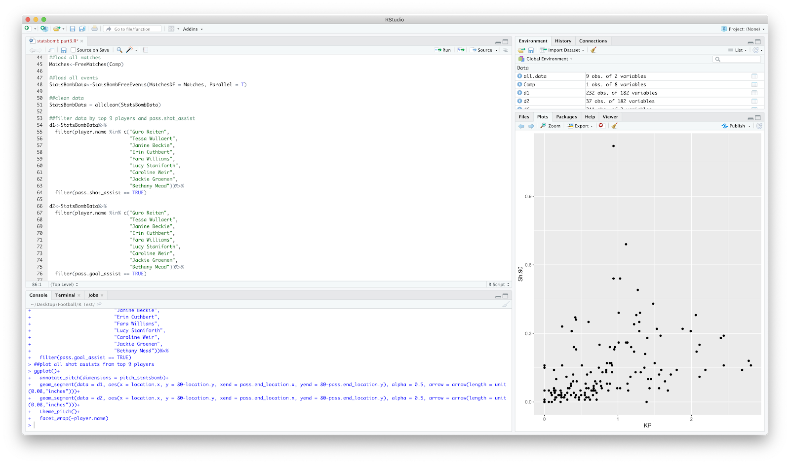
Following this, we will just focus on shot assists. A very quick look at the scatter and in the bottom right we can see the players which produce the top shot assists P90 in the league.
We can take this a step further by doing a quick dplyr filter of the top 9 players. The code:
##find top 9 key passers
all.data=all.data%>%
select(Player, KP)%>%
arrange(-KP)%>%
top_n(9)
The above selects the 'Player' and 'KP' column, arranges from highest to lowest (the minus sign arranges high to low), before only showing the top 9 players. You can obviously play around with the number, I just chose 9 for ease of plotting later. Your all.data show now look like below:
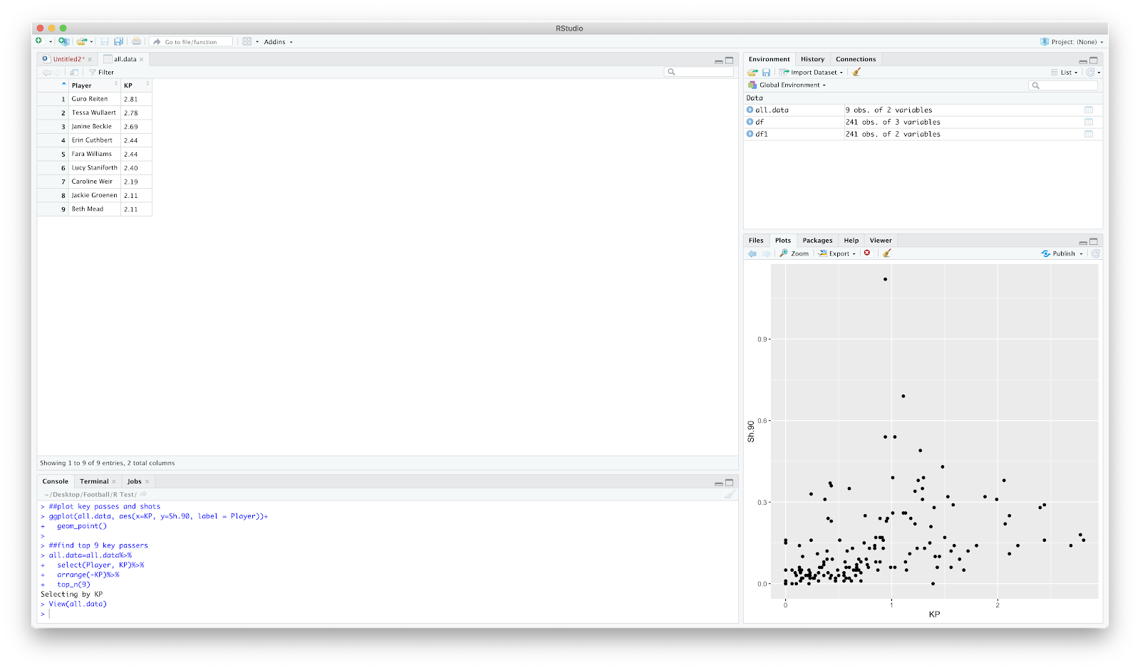
So thats the preliminary filter complete. We now know the top 9 shot assist WSL players. You could obviously do a filter on the fbref site, but where's the coding fun in that?
Anyway, on to the event data. This is the same as the previous two tutorials, however I have removed the specific game filter. We will be loading in all events, from all matches in the 19/20 WSL season:
##load competitions - this season WSL
Comp<-FreeCompetitions()%>%filter(competition_id==37, season_name=="2019/2020")
##load all matches
Matches<-FreeMatches(Comp)
##load all events
StatsBombData<-StatsBombFreeEvents(MatchesDF = Matches, Parallel = T)
##clean data
StatsBombData = allclean(StatsBombData)
Using all.data that was created earlier, we have the top 9 shot assist players so can now filter the StatsBomb events.
We now have a new dataframe, d1 and d2 which includes includes the 9 players earlier highlighted along with all passes that assist a shot, including goal assists. We can now plot this using the ggsoccer package. I use this a lot as it created in ggplot so is great for editing and over plotting. To draw the pitch:
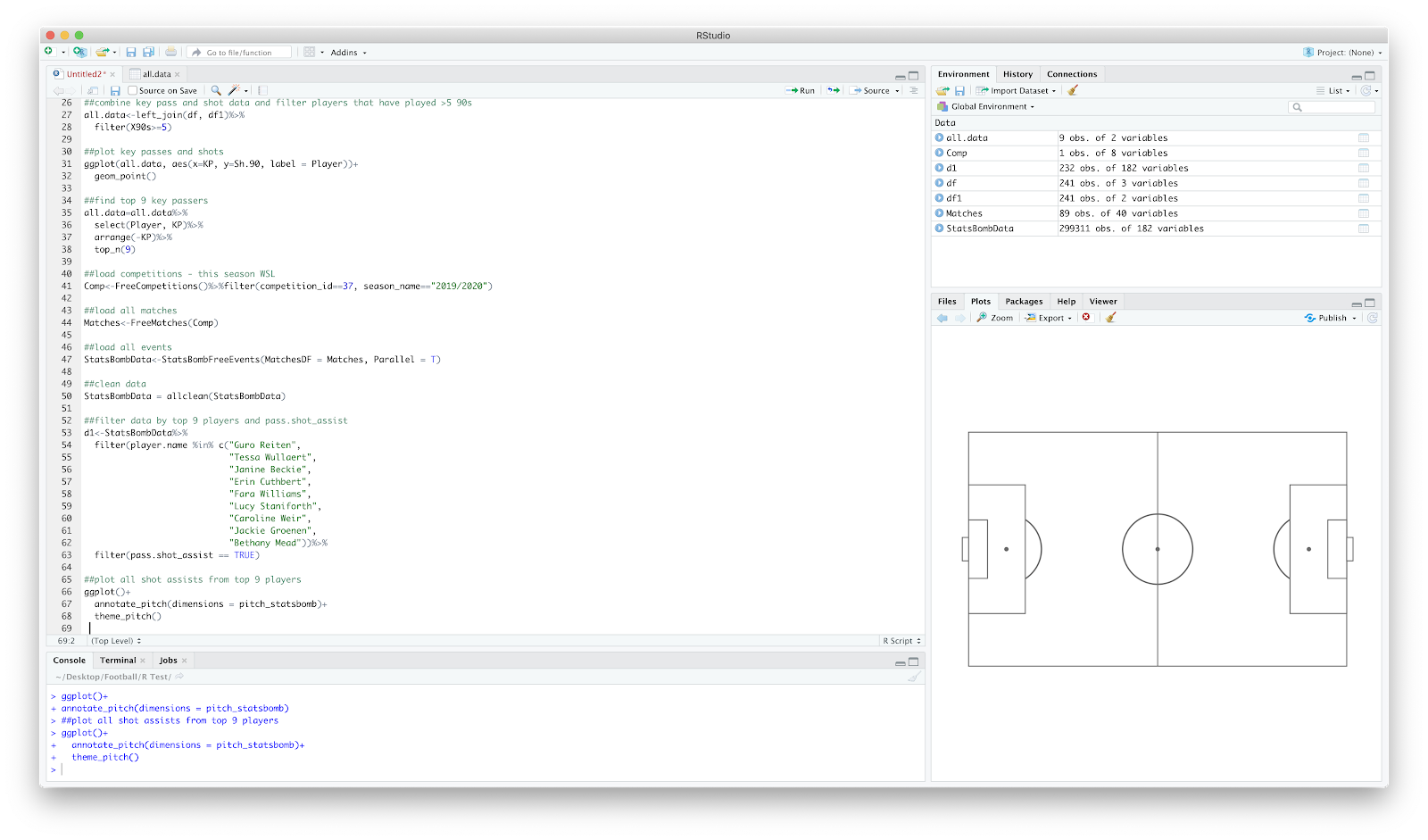
ggplot()+
annotate_pitch(dimensions = pitch_statsbomb)
Will plot the pitch, however the grey plot theme remains - this can be removed by:
theme_pitch()
This will also adjust the aspect ratio.
You should have something that looks like:
We have the blank pitch, now to over plot the shot assists. I have just used geom_segment() to create the pass map, however we need to add 80- in front of 'y=' to reverse the axis within geom_segment(). This was done in the previous 2 tutorials using scale_y_reverese(), however implementing this with the ggsoccer package removes some of the pitch annotations...therefore I used the code:
ggplot()+
annotate_pitch(dimensions = pitch_statsbomb)+
theme_pitch()+
geom_segment(data = d1, aes(x = location.x, y = 80-location.y, xend = pass.end_location.x, yend = 80-pass.end_location.y), alpha = 0.5, arrow = arrow(length = unit(0.08,"inches")))+
geom_segment(data = d2, aes(x = location.x, y = 80-location.y, xend = pass.end_location.x, yend = 80-pass.end_location.y), alpha = 0.5, arrow = arrow(length = unit(0.08,"inches")))
With the output of:
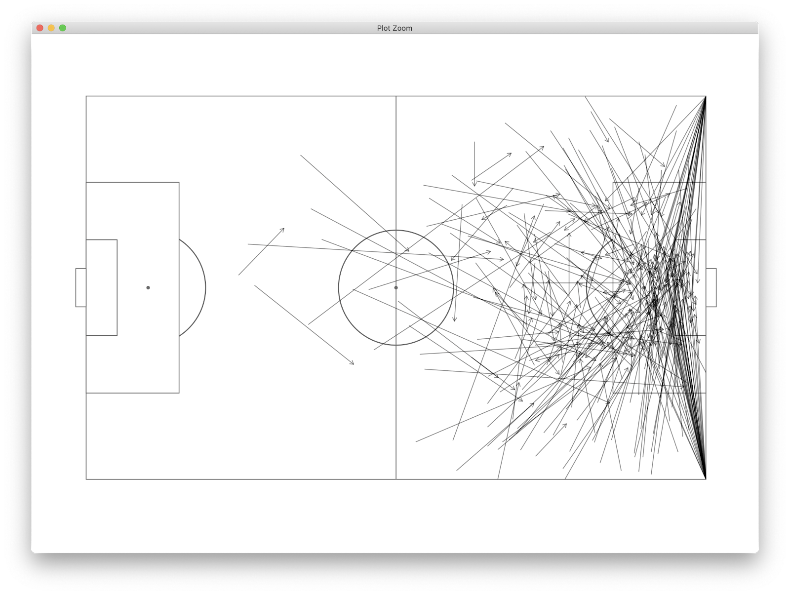
This already tells us a fair bit, however we can further break this down by the 9 players we are looking at by using facet_wrap(~player.name). This essentially repeats the above plot for each player so we can view all alongside one another:
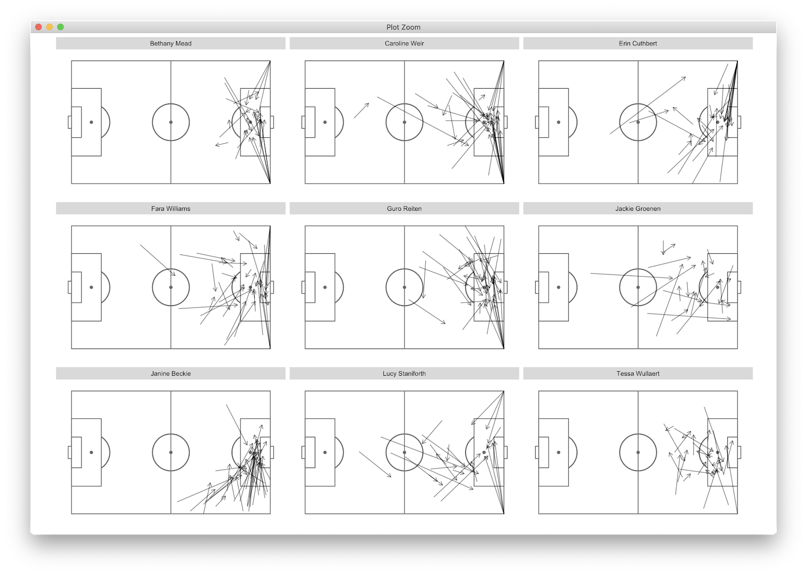
We now have all shot assist passes for the top 9 players (by shot assist p90) in the WSL. We can glean that many of Weir's shot assists come from corners, whilst Beckie and Groenen *appear* to come from open play situations. To further filter, we can add:
play_pattern.name == "Regular Play"
To the d1 and d2 filter to remove all set pieces, resulting in:
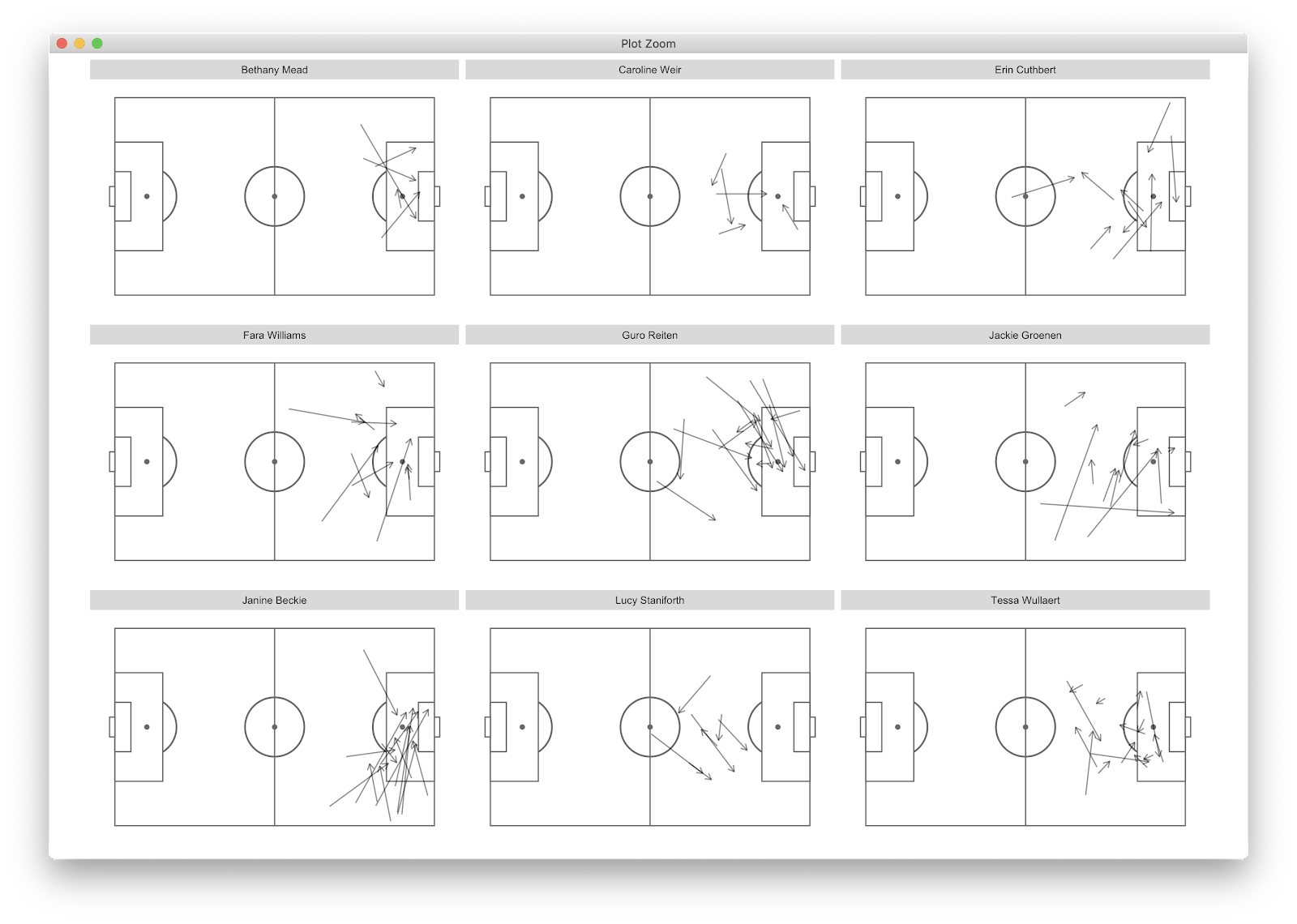
This changes things considerably as Weir's shot assists look primarily to come from set pieces, whilst Beckie, Groenen and Wullaert create from open play situations. Reiten has a specific zone on the left side that she utilises whilst Staniforth mainly creates outiside of the 18 yeard box whilst Beckie has decent volume from the final third delivering between the penalty spot and 6 yard box. We could further break this down by pitch locations where the passes start or end. Using the previous tutorial we could also add counts etc to add further information.
This is a quick overview of how to elevate scatter plots. Scatters are great for an initial overview, however further filtering into event data can allow us to differentiate between playing styles, how players create and the main locations in which that creativity comes from/to.
In the next tutorial I will use the y axis of the initial scatter, shots, to plot the shot locations of 9 players. Yeeha.
As always, feedback - good or bad is welcome.
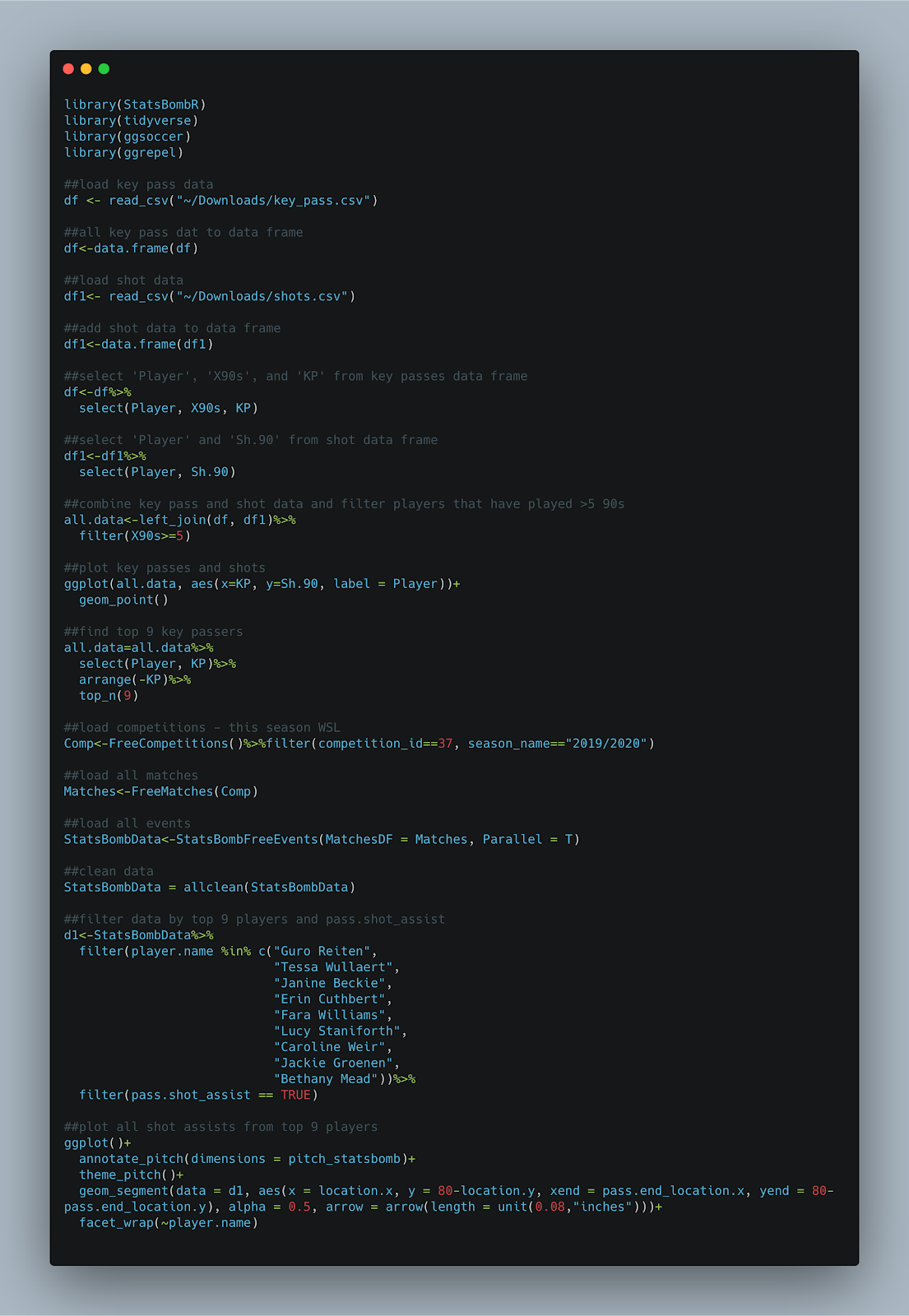
The full code:
The question that I posed myself was:
"How can we go beyond scatters to learn more about a players output?"
There has been an increase in scatter plots to show players that excel, however they don't tell the whole story.
As always, I'm still learning code myself so I'm sure there is code in here that will upset experienced coders! Sorry!
Anyway, a rough idea of how this will look -
- download data from fbref.com
- plot a scatter using the data
- filter the top 9 performers for one parameter
- plot the event data
- compare the player outputs
Lets goooooooooooo
Lets fire up:
library(StatsBombR)
library(tidyverse)
library(ggsoccer)
library(ggrepel)
We could create the P90 data for the WSL ourselves by using the StatsBomb data, however I'm being lazy by downloading from fbref.com. I'm looking at two simple metrics - shots P90 and shots assisted P90.
Once I've downloaded from fbref I remove the top row and save as .csv.
As the data we require sits in two different files, there is some preparation to do before plotting.
The below loads the key pass (df) and shot (df1) data and adds to a data frame.
From here, I selected the columns we require in both dataframes (df = Player, X90s, and KP) and df1 = Player, Sh.90. Finally, I combined the two data frames using left_join before filtering players that have only played >5 90s.
View(all.data) should return 4 columns of Player, KP, X90s and Sh.90
Now that we have the numbers we require in one place, we can move on to plotting. Personally, I like to throw a quick scatter together as it gives a quick overview - plus I tend to need something visual for it to sink in!
Anyway, ggplot to throw a scatter together. You can make it as fancy as you like, I just use geom_point and ggrepel.
Following this, we will just focus on shot assists. A very quick look at the scatter and in the bottom right we can see the players which produce the top shot assists P90 in the league.
We can take this a step further by doing a quick dplyr filter of the top 9 players. The code:
##find top 9 key passers
all.data=all.data%>%
select(Player, KP)%>%
arrange(-KP)%>%
top_n(9)
The above selects the 'Player' and 'KP' column, arranges from highest to lowest (the minus sign arranges high to low), before only showing the top 9 players. You can obviously play around with the number, I just chose 9 for ease of plotting later. Your all.data show now look like below:
So thats the preliminary filter complete. We now know the top 9 shot assist WSL players. You could obviously do a filter on the fbref site, but where's the coding fun in that?
Anyway, on to the event data. This is the same as the previous two tutorials, however I have removed the specific game filter. We will be loading in all events, from all matches in the 19/20 WSL season:
##load competitions - this season WSL
Comp<-FreeCompetitions()%>%filter(competition_id==37, season_name=="2019/2020")
##load all matches
Matches<-FreeMatches(Comp)
##load all events
StatsBombData<-StatsBombFreeEvents(MatchesDF = Matches, Parallel = T)
##clean data
StatsBombData = allclean(StatsBombData)
Using all.data that was created earlier, we have the top 9 shot assist players so can now filter the StatsBomb events.
We now have a new dataframe, d1 and d2 which includes includes the 9 players earlier highlighted along with all passes that assist a shot, including goal assists. We can now plot this using the ggsoccer package. I use this a lot as it created in ggplot so is great for editing and over plotting. To draw the pitch:
ggplot()+
annotate_pitch(dimensions = pitch_statsbomb)
Will plot the pitch, however the grey plot theme remains - this can be removed by:
theme_pitch()
This will also adjust the aspect ratio.
You should have something that looks like:
We have the blank pitch, now to over plot the shot assists. I have just used geom_segment() to create the pass map, however we need to add 80- in front of 'y=' to reverse the axis within geom_segment(). This was done in the previous 2 tutorials using scale_y_reverese(), however implementing this with the ggsoccer package removes some of the pitch annotations...therefore I used the code:
ggplot()+
annotate_pitch(dimensions = pitch_statsbomb)+
theme_pitch()+
geom_segment(data = d1, aes(x = location.x, y = 80-location.y, xend = pass.end_location.x, yend = 80-pass.end_location.y), alpha = 0.5, arrow = arrow(length = unit(0.08,"inches")))+
geom_segment(data = d2, aes(x = location.x, y = 80-location.y, xend = pass.end_location.x, yend = 80-pass.end_location.y), alpha = 0.5, arrow = arrow(length = unit(0.08,"inches")))
With the output of:
This already tells us a fair bit, however we can further break this down by the 9 players we are looking at by using facet_wrap(~player.name). This essentially repeats the above plot for each player so we can view all alongside one another:
We now have all shot assist passes for the top 9 players (by shot assist p90) in the WSL. We can glean that many of Weir's shot assists come from corners, whilst Beckie and Groenen *appear* to come from open play situations. To further filter, we can add:
play_pattern.name == "Regular Play"
To the d1 and d2 filter to remove all set pieces, resulting in:
This changes things considerably as Weir's shot assists look primarily to come from set pieces, whilst Beckie, Groenen and Wullaert create from open play situations. Reiten has a specific zone on the left side that she utilises whilst Staniforth mainly creates outiside of the 18 yeard box whilst Beckie has decent volume from the final third delivering between the penalty spot and 6 yard box. We could further break this down by pitch locations where the passes start or end. Using the previous tutorial we could also add counts etc to add further information.
This is a quick overview of how to elevate scatter plots. Scatters are great for an initial overview, however further filtering into event data can allow us to differentiate between playing styles, how players create and the main locations in which that creativity comes from/to.
In the next tutorial I will use the y axis of the initial scatter, shots, to plot the shot locations of 9 players. Yeeha.
As always, feedback - good or bad is welcome.
The full code:
Thanks for this! Finding these posts real good fun to follow! Just a quick question... I seem to be struggling getting players names to be shown after the command:
ReplyDeleteggplot(all.data,aes(x=KP,y=Sh.90,label=Player))+...
The graph and all the relevant points are created, but no label. Have you got any suggestions for a remedy?
JB
Extraordinary message. I like to inspect this message considering I satisfied such a lot of brand-new authentic elements worrying it really. Indyjska-wiza-medyczna
ReplyDeleteThis was a very informative post! The way you explained the use of StatsBomb data with practical examples makes sports analytics much easier to understand, especially for students and beginners exploring data visualization and statistical modeling. Content like this is also a great reference for those working on research projects or technical reports. Students looking to improve their reports and analyses can benefit from academic writing services that help organize data-driven insights into clear, well-structured academic documents. Thanks for sharing such valuable knowledge
ReplyDelete