Im not sure if anyone is following these, but I will do one more and see what happens!
I have covered some passing based stuff, I thought it might be useful to look into shots.
Therefore, the rough plan for this piece:
1) Total player xG in the WSL for this season
2) Find the top 9 players based on xG
3) Plot all shots taken including xG
4) Add labels
5) Plot the shot map of the 9 players against one another
As always, my coding is in the learning stage so this isn't a definitive way...just something that works for me and might help others!
Anyway, load in this seasons WSL data as we have previously.
We want to extract 3 things from the data - the number of shots, numbers of goals and total xG (initially including penalties)
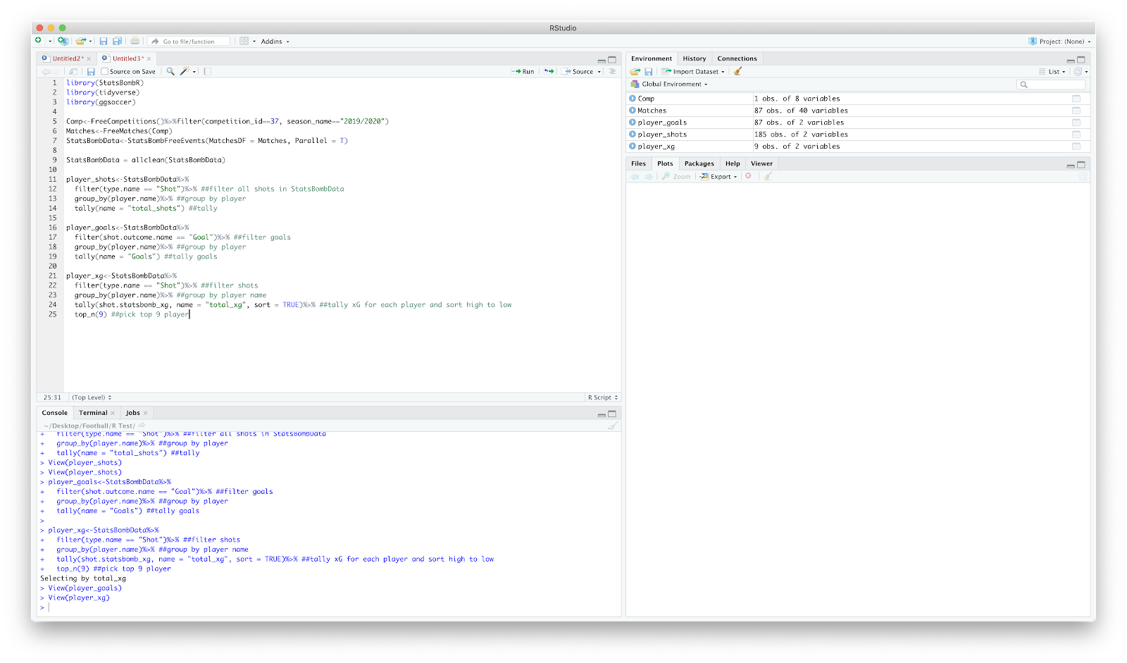
To start - tallying player shots:
player_shots<-StatsBombData%>%
filter(type.name == "Shot")%>% ##filter all shots in StatsBombData
group_by(player.name)%>% ##group by player
tally(name = "total_shots") ##tally
Once you've run the above you should have two columns - one with the player name, another with the total shots that player has taken. You essentially run the same as above for goals and xG:
player_goals<-StatsBombData%>%
filter(shot.outcome.name == "Goal")%>% ##filter goals
group_by(player.name)%>% ##group by player
tally(name = "Goals") ##tally goals
player_xg<-StatsBombData%>%
filter(type.name == "Shot")%>% ##filter shots
group_by(player.name)%>% ##group by player name
tally(shot.statsbomb_xg, name = "total_xg", sort = TRUE)%>% ##tally xG for each player and sort
top_n(9) ##pick top 9 players
You should have something like below:
Next challenge, to combine the three tables into one and calculate xg_per_shot:
summary <- left_join(player_xg, player_shots, by = "player.name")%>% ##join player_xg and player_shots
mutate(xg_per_shot = sprintf("%0.2f",total_xg/total_shots)) ##calculate xg_per_shot
Finally, left_join() the goals:
summary<-left_join(summary, player_goals, by = "player.name")
view(summary) and we should get:
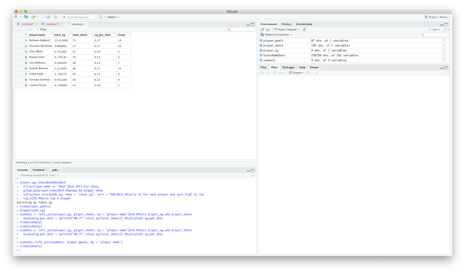
Lovely stuff, this table already gives us some reasonable insight...Bremer with 10 goals off 5.3xG!
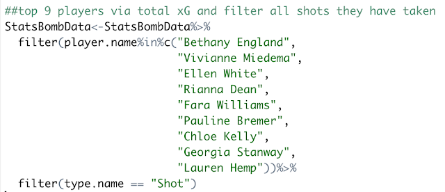
Now that we have the top 9 players by total xG plus some additional numbers, we can filter the original StatsBombData data frame by the 9 players and all shots they have taken:
As always, give the data frame a check and have a look at the player.name and type.name columns - hopefully nothing unexpected in there!
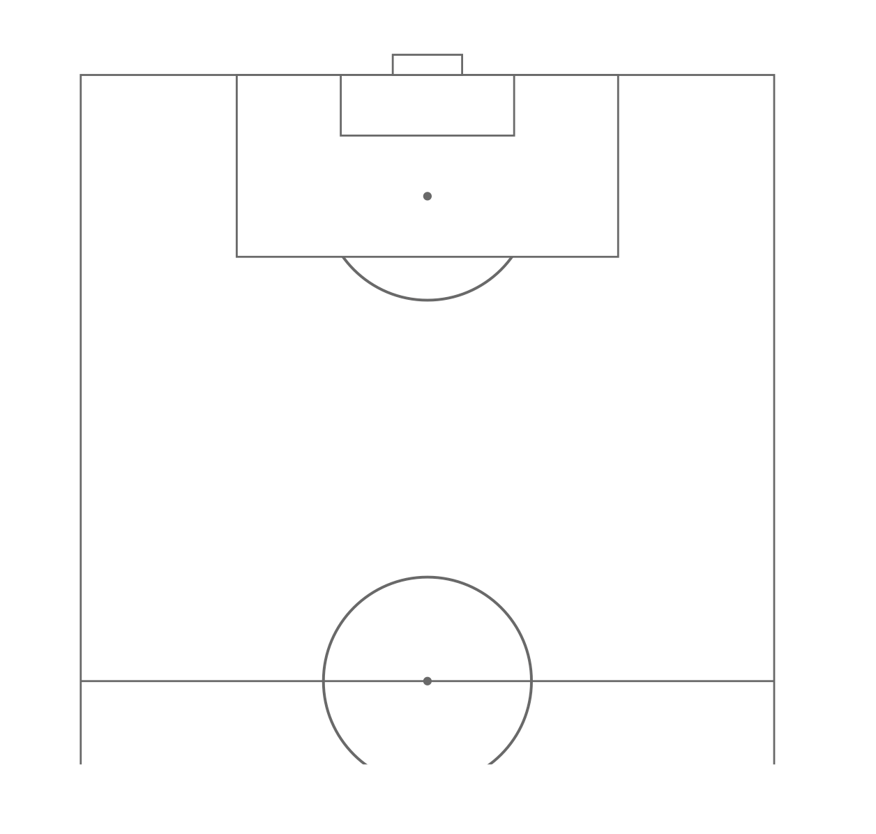
With the above completed, we can move on to the plotting. Again, using the ggsoccer package we can build a pitch from the ground up allow us to plot shots on top.
ggplot()+
annotate_pitch(dimensions = pitch_statsbomb)+
theme_pitch()+
coord_flip(xlim = c(55, 120),
ylim = c(-12, 105))
Equates to:
Good start...now to add all shots with geom_point():
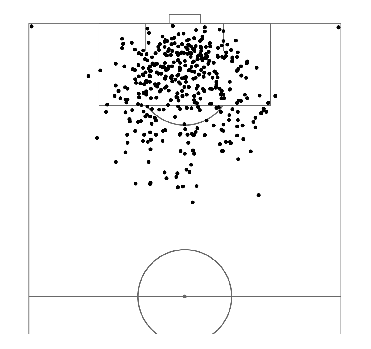
We appear to have a couple of shots from corners....fun...or something has gone wrong! Will check this later.
We can adapt the size of the geom_point() by using the size function within the aes(). Size = shot.statsbomb_xg will result in:
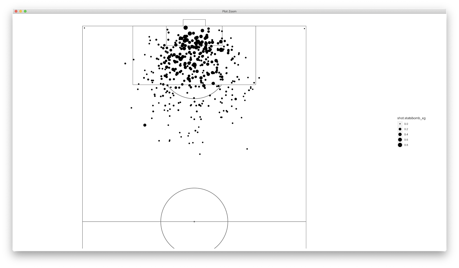
This tells us what we know about xG...the closer you are to goal and the more central you are = higher xG. Unsurprisingly, the shot attempts from the corners don't score too highly on xG! Now to colour the points to highlight those shots that were goals:
colour = shot.outcome.name == "Goal"
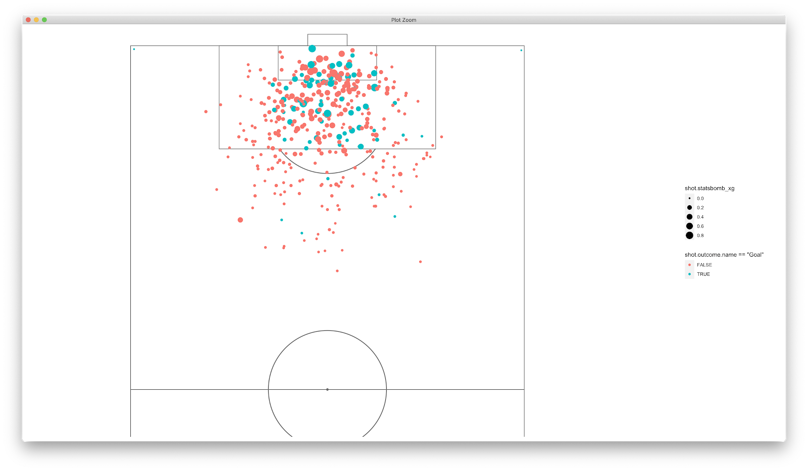
Using scale_colour_manual we can alter the TRUE/FALSE legend:
scale_colour_manual(values = c("#ff4444", "#5e9a78"), labels = c("No-Goal", "Goal"), name = "Shot Outcome")
I have just picked random red and green colours to highlight no-goal or goal. You can obviously get playful altering this as you wish.
We can glean a decent amount of information from the above, where goals are scored from, the xG values of those goals, but would be handy to compare across the 9 players we filtered. Much like the passing, and an advantage of using ggsoccer we can use facet_wrap() to compare players:
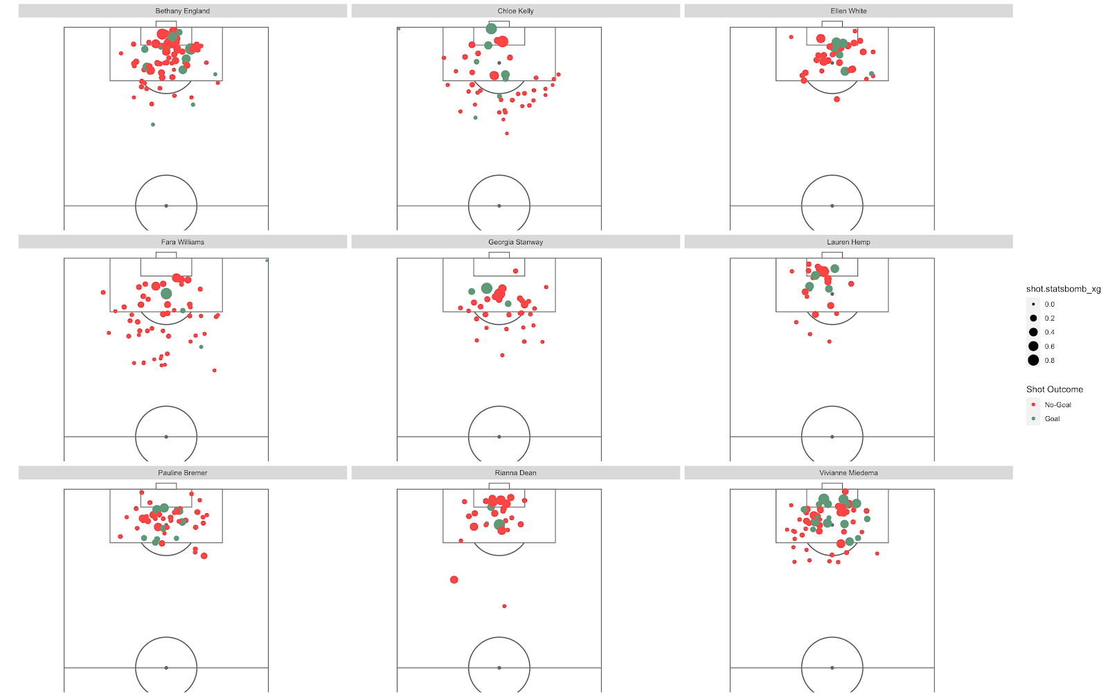
This now gives us loads of insight. If you are a scout/coach you can establish some decent information...just from a quick scan:
- Both Kelly and Williams scored from corners
- Miedema and England are the stand out for attempts in the six yard box
- Kelly favours the inside right on the edge of the 18 yard box - pretty unsuccessfully
Etc etc!
Finally, to add some labels to give further information. You can use geom_text() or geom_label(), but you can use the 'summary' table we compiled earlier to plot this. Using geom_label():
geom_label(data=summary, size = 3, colour = "black", aes(x = 65, y=65, label = paste0("Goals: ", Goals)))
You can add any of the statistics that were calculated earlier and position wherever you like - mess about with it and see what works.
Finally, I will add labs() to rename the xG legend and add a title/subtitle, then you can go mad on the theme() setting to change colours, fonts etc!
The final plot should look like:
Hopefully this was a logical and sensible walk through of how to produce an xG shot map. As always, feel free to message me if you have any questions or queries! (Equally if I can do better - I'm still learning myself!)
To take this further you can remove penalties and create a NPxG shot map also!
The final code:
I have covered some passing based stuff, I thought it might be useful to look into shots.
Therefore, the rough plan for this piece:
1) Total player xG in the WSL for this season
2) Find the top 9 players based on xG
3) Plot all shots taken including xG
4) Add labels
5) Plot the shot map of the 9 players against one another
As always, my coding is in the learning stage so this isn't a definitive way...just something that works for me and might help others!
Anyway, load in this seasons WSL data as we have previously.
We want to extract 3 things from the data - the number of shots, numbers of goals and total xG (initially including penalties)
To start - tallying player shots:
player_shots<-StatsBombData%>%
filter(type.name == "Shot")%>% ##filter all shots in StatsBombData
group_by(player.name)%>% ##group by player
tally(name = "total_shots") ##tally
Once you've run the above you should have two columns - one with the player name, another with the total shots that player has taken. You essentially run the same as above for goals and xG:
player_goals<-StatsBombData%>%
filter(shot.outcome.name == "Goal")%>% ##filter goals
group_by(player.name)%>% ##group by player
tally(name = "Goals") ##tally goals
player_xg<-StatsBombData%>%
filter(type.name == "Shot")%>% ##filter shots
group_by(player.name)%>% ##group by player name
tally(shot.statsbomb_xg, name = "total_xg", sort = TRUE)%>% ##tally xG for each player and sort
top_n(9) ##pick top 9 players
You should have something like below:
Next challenge, to combine the three tables into one and calculate xg_per_shot:
summary <- left_join(player_xg, player_shots, by = "player.name")%>% ##join player_xg and player_shots
mutate(xg_per_shot = sprintf("%0.2f",total_xg/total_shots)) ##calculate xg_per_shot
Finally, left_join() the goals:
summary<-left_join(summary, player_goals, by = "player.name")
view(summary) and we should get:
Lovely stuff, this table already gives us some reasonable insight...Bremer with 10 goals off 5.3xG!
Now that we have the top 9 players by total xG plus some additional numbers, we can filter the original StatsBombData data frame by the 9 players and all shots they have taken:

As always, give the data frame a check and have a look at the player.name and type.name columns - hopefully nothing unexpected in there!
With the above completed, we can move on to the plotting. Again, using the ggsoccer package we can build a pitch from the ground up allow us to plot shots on top.
ggplot()+
annotate_pitch(dimensions = pitch_statsbomb)+
theme_pitch()+
coord_flip(xlim = c(55, 120),
ylim = c(-12, 105))
Equates to:
Good start...now to add all shots with geom_point():
We appear to have a couple of shots from corners....fun...or something has gone wrong! Will check this later.
We can adapt the size of the geom_point() by using the size function within the aes(). Size = shot.statsbomb_xg will result in:
This tells us what we know about xG...the closer you are to goal and the more central you are = higher xG. Unsurprisingly, the shot attempts from the corners don't score too highly on xG! Now to colour the points to highlight those shots that were goals:
colour = shot.outcome.name == "Goal"
Using scale_colour_manual we can alter the TRUE/FALSE legend:
scale_colour_manual(values = c("#ff4444", "#5e9a78"), labels = c("No-Goal", "Goal"), name = "Shot Outcome")
I have just picked random red and green colours to highlight no-goal or goal. You can obviously get playful altering this as you wish.
We can glean a decent amount of information from the above, where goals are scored from, the xG values of those goals, but would be handy to compare across the 9 players we filtered. Much like the passing, and an advantage of using ggsoccer we can use facet_wrap() to compare players:
This now gives us loads of insight. If you are a scout/coach you can establish some decent information...just from a quick scan:
- Both Kelly and Williams scored from corners
- Miedema and England are the stand out for attempts in the six yard box
- Kelly favours the inside right on the edge of the 18 yard box - pretty unsuccessfully
Etc etc!
Finally, to add some labels to give further information. You can use geom_text() or geom_label(), but you can use the 'summary' table we compiled earlier to plot this. Using geom_label():
geom_label(data=summary, size = 3, colour = "black", aes(x = 65, y=65, label = paste0("Goals: ", Goals)))
You can add any of the statistics that were calculated earlier and position wherever you like - mess about with it and see what works.
Finally, I will add labs() to rename the xG legend and add a title/subtitle, then you can go mad on the theme() setting to change colours, fonts etc!
The final plot should look like:
Hopefully this was a logical and sensible walk through of how to produce an xG shot map. As always, feel free to message me if you have any questions or queries! (Equally if I can do better - I'm still learning myself!)
To take this further you can remove penalties and create a NPxG shot map also!
The final code:
Nice info!
ReplyDeletePHP Course in Chennai
PHP Course in Bangalore
Hello there, I tried using this StatsBomb package, and I'm using it for a project regarding the debate between Messi and Ronaldo, but for some reason, there is so little data for Ronaldo. I've made various attempts to solve the issue, but it just seems that the data simply does not include a lot of Real Madrid data (basically exclusively showing Barcelona data) and thus Ronaldo has basically no data. Do you happen to know why this is happening?
ReplyDeleteVery interesting, good job, and thanks for sharing such a good blog.
ReplyDeleteเว็บบอล
Thank you for your post. This is excellent information. It is amazing and wonderful to visit your site.
ReplyDeleteเว็บบอลดีที่สุด
Fantastic Post Thanks for sharing this kind of wonderful post from this website
ReplyDeleteเว็บบอล
Waooow!! Nice blog, this will be greatly helpful.
ReplyDeleteเว็บบอลดีที่สุด
Thank you for sharing this informative and well-written article. The content was easy to follow, and I appreciated how the key concepts were explained in a clear and engaging manner. The practical examples and thoughtful insights made the topic more accessible and valuable for readers of all backgrounds. Students often look for additional academic resources when tackling complex subjects, and maths assignment help uk is a commonly searched term among those seeking guidance. Overall, this was a great read that offers useful takeaways. I look forward to seeing more insightful posts from you.
ReplyDelete